Linos: #5 through 15
introduction
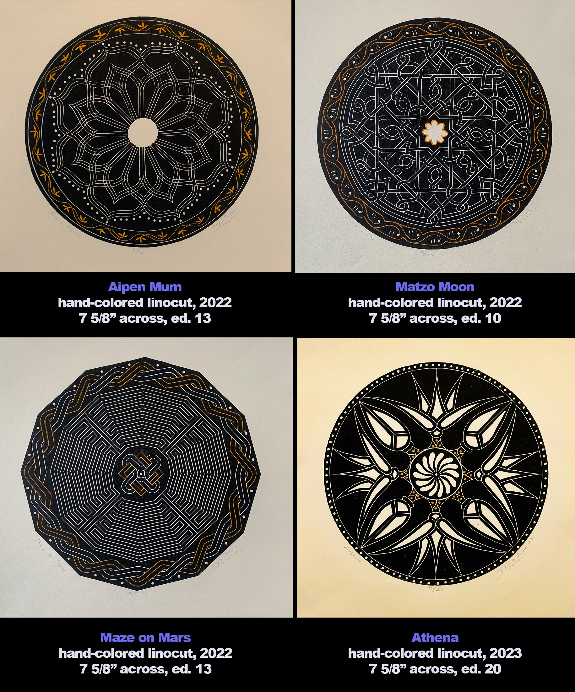
In June of 2023 I posted the ART I MAKE blog post “Linocuts: Making of Athena.” It celebrated the fourth hand-colored circular linocut in a series I began in 2022 as an adjunct to a group of circular watercolors I was about to show that fall at Gallery Blue Door in Baltimore. (See LINK)
“Athena” was the first of four related linocuts created in 2023. A fifth was begun in December 2023 and editioned in early January 2024. More importantly my enthusiasm for the series induced me to boldly propose a book of my linocuts paired with haiku by my good friend Karen Klein, a wonderful poet, sculptor and modern dancer whom I met in 1989 during my first artist residency at the Virginia Center for the Creative Arts.
I proposed to produce a total of 12 linocuts for “our” book. With only eight completed by January 2023, that meant I needed four more this year. More specifically I still needed four more on June 1 2024. In that gap of months I had focused on watercolors largely because I enjoyed an artist residency at The Studios of Key West from mid-February to mid-March. There I begun four large paintings, including two of drag queens, as part of my “2 by 2” series of couples. (See LINK) Plus there was a week’s driving trip to North Carolina and, oh, knee surgery.
Once I did direct my energies to printmaking in June, those required four came quickly: two were completed in June and two in July. Despite having my 12, I didn’t stop. The series progressed with two more in September and the 15th and last in early October.
In this second post on linocut making, I’ll quickly take the reader through the 11 prints produced after the June 2023 ART I MAKE post, matching each new print with its design source and describing in what way I was trying to stretch my vocabulary as a linocut artist.
AT PLAY
While the following will discuss the logistics of of the next 11 linocuts in the order of their creation, please keep in mind that there is an overall esthetic: the essential sense of peace that the circle creates, no matter whether the source material is a Roman mosaic, South Seas barkcloth, early 19th-century glassware, or folk art from northern India. The completeness of the circle can provide no escape. If you allow yourself to be captive by the circle, the circle can become everything, all that is necessary, life itself.
Now I don’t want to pretend that my decisions were prescribed by metaphysics. Once I set the circle as the overriding shape, I began to play. For starters I played with the tension between the center design and the border pattern. As the series progressed I slowly sculpt the perimeter, from a true circle, to a scalloped circle, to an implied circle. In the 15th linocut the border overtakes the center, making the latter vestigial. That transition wasn’t my initial intention, but playing within a theme was enough as a catalyst.
And I played with a transition from white-line cutting to black-line cutting. Once again it wasn’t intentional. It just happened, and I didn’t recognize that it was happening until deep into the series of 15 linocuts. Before the series began, I made wood engravings, a medium where the image is frequently realized by a series of white lines or white marks. As I explained in my first linocut post, the move to linoleum cutting was solely based on the decision to work in circles, linoleum being so much easier to shape into a circle compared to the effort and cost of cutting a block of wood.
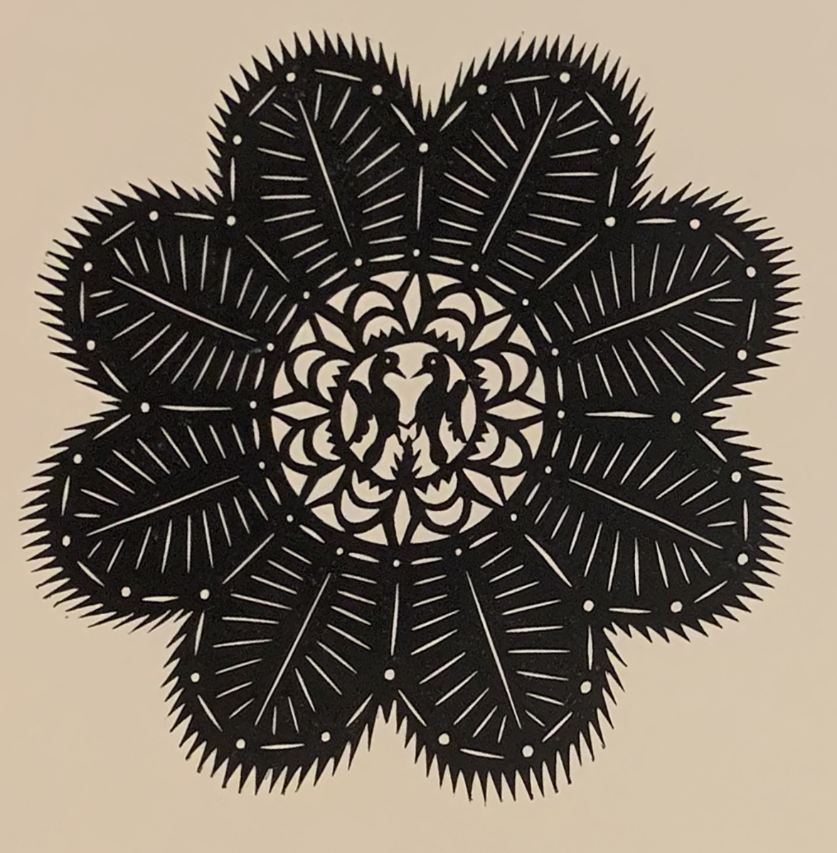
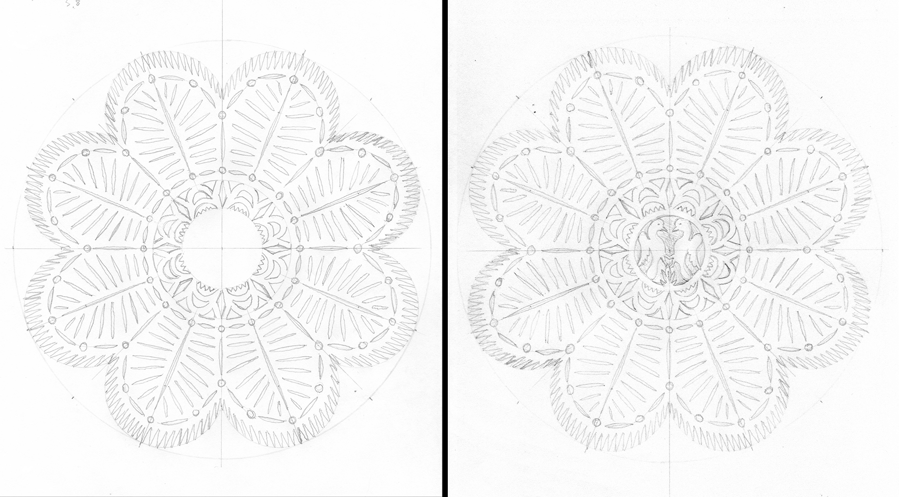
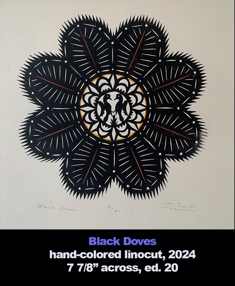
While the move to linoleum necessitated a change of tools–ones appropriate for the softer matrix of linoleum–my designs and mark-making were guided by the esthetic of white-line wood engraving. (When I refer to white lines, I mean areas that are white defined by black on either side. Conversely, when I talk about black lines, I mean areas of black that are defined by white on either side.) Slowly shapes defined by areas of white appeared as the series progressed. “Athena” has areas where lotus buds and flowers are enhanced by white shapes but not defined by them. Not until “Black Doves”–the 8th linocut–do black lines have an important role, namely in the center. The uncolored version of “Black Doves” (right) has white lines articulating the petals and black lines defining the center motifs.
Black lines become the dominant design element in the last five prints, with white lines more and more serving a subservient role.
Linos: #5 through 15
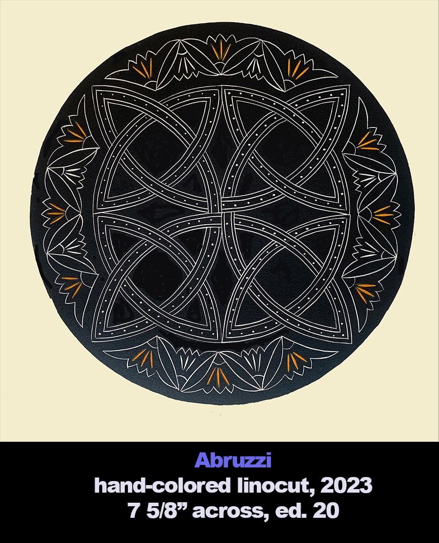
Abruzzi
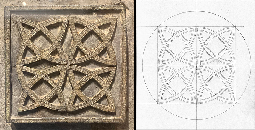
Like it did for “Athena,” The Walters Art Gallery, which I lovingly call my home museum, exhibited an object that inspired “Abruzzi.” It was a small bronze panel from a late 12th-century church in the Italian province of Abruzzi. I sketched it in 2002 when I was working on a series of watercolors in which I made arrangements from parts of various objects on display at the Walters. However, I hadn’t used the Abruzzi panel in any of the paintings. But for this series I perused old sketchbooks for ideas and again the Abruzzi panel caught my eye.
I returned to the Walters and was delighted to see the panel still on display. After photographing it, I then tried to photoshop the image into a working linocut design. That wasn’t successful, but as you see, a little compass work was all it took to recreate the design. I made the Abruzzi panel design fit within a 8-inch circle.
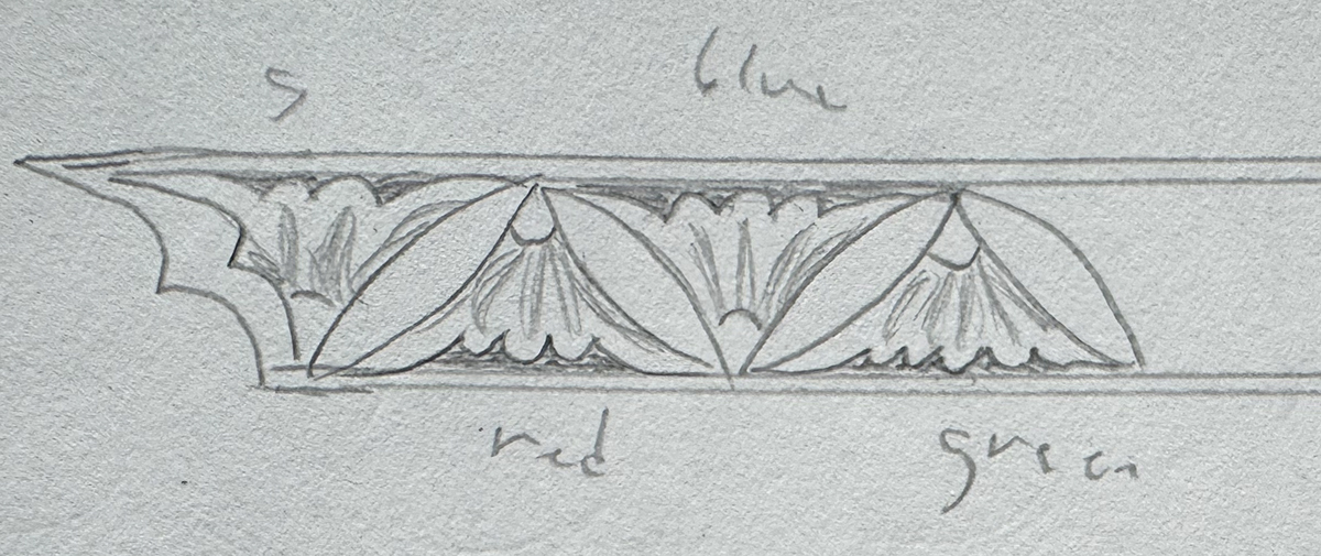
To complete the image I needed a broken border to fill the areas of the circle not encompassed by the Abruzzi design. Once again I turned to my sketchbook. On one of the pages that I drew from the illuminated medieval Armenian manuscript known as W543 (W for Walters) was a small sketch of a border from a canon table. It showed a meander of blossoms that alternately opened up and down. Miraculously it fit perfectly.
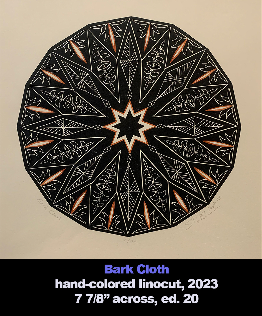
Bark Cloth
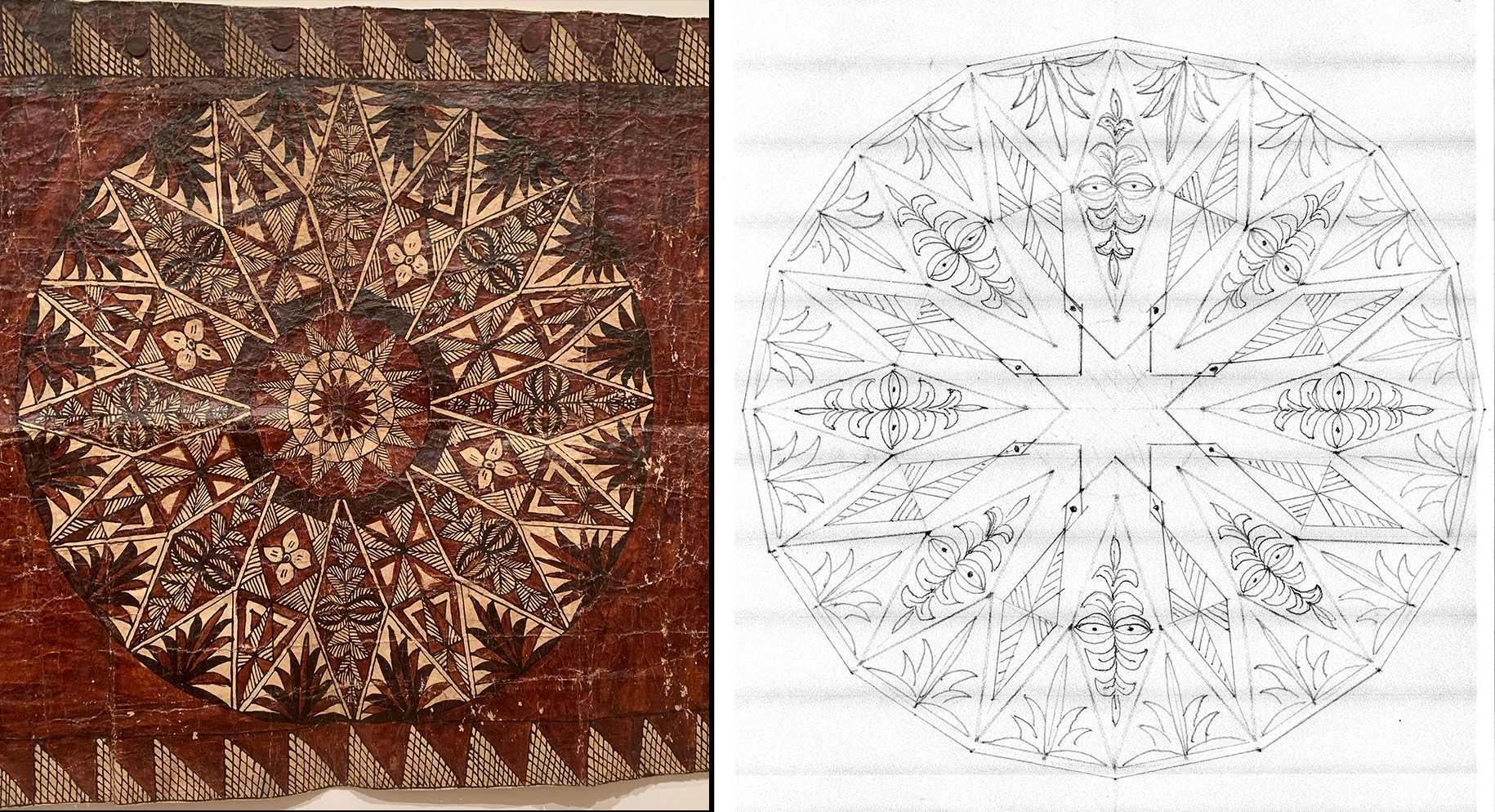
My other local museum, the Baltimore Museum of Art, had a small exhibit in the summer of 2023 that inspired “Bark Cloth.” I was completely unfamiliar with the medium in which tree bark was transformed into either a textile or a surface for painting. It appeared that the craft was developed independently in parts of Africa and Oceania.
From an online search of the BMA on the “The Matter of Bark Cloth” exhibition: “The production of Oceanic bark cloth, oftentimes called tapa, began nearly 8,000 years ago and spread from southern China to southeast Asia, Indonesia, and the Philippines before moving into western Oceanic islands such as Papua New Guinea, and eventually east to Hawai’i and Rapa Nui (Easter Island). Bark cloth examples in the exhibition from Papua New Guinea, Tonga, Fiji, American Samoa, and Hawai’i demonstrate the range of artistic production across the various states, societies, and cultures.” Kevin Tervala, chief curator of the BMA, curated the exhibition. (See LINK) There is also under the heading “BMA/Stories” an article by Irene Bantigue called “Bark Cloth Defies Categorization” with several photos from the exhibition. (See LINK)
However, neither BMA post has a photo of the large piece of Oceanic bark cloth that caught my eye. Unfortunately I hadn’t photographed the whole piece, just its center tondo, an obvious inspiration for one of my linocuts. Once again I reconstructed its composition on paper with a compass and protractor. The center of the bark cloth was nonconforming to the rest of its geometry. So I used the geometry of the alternating diamonds to define the center with its an eight-pointed star.
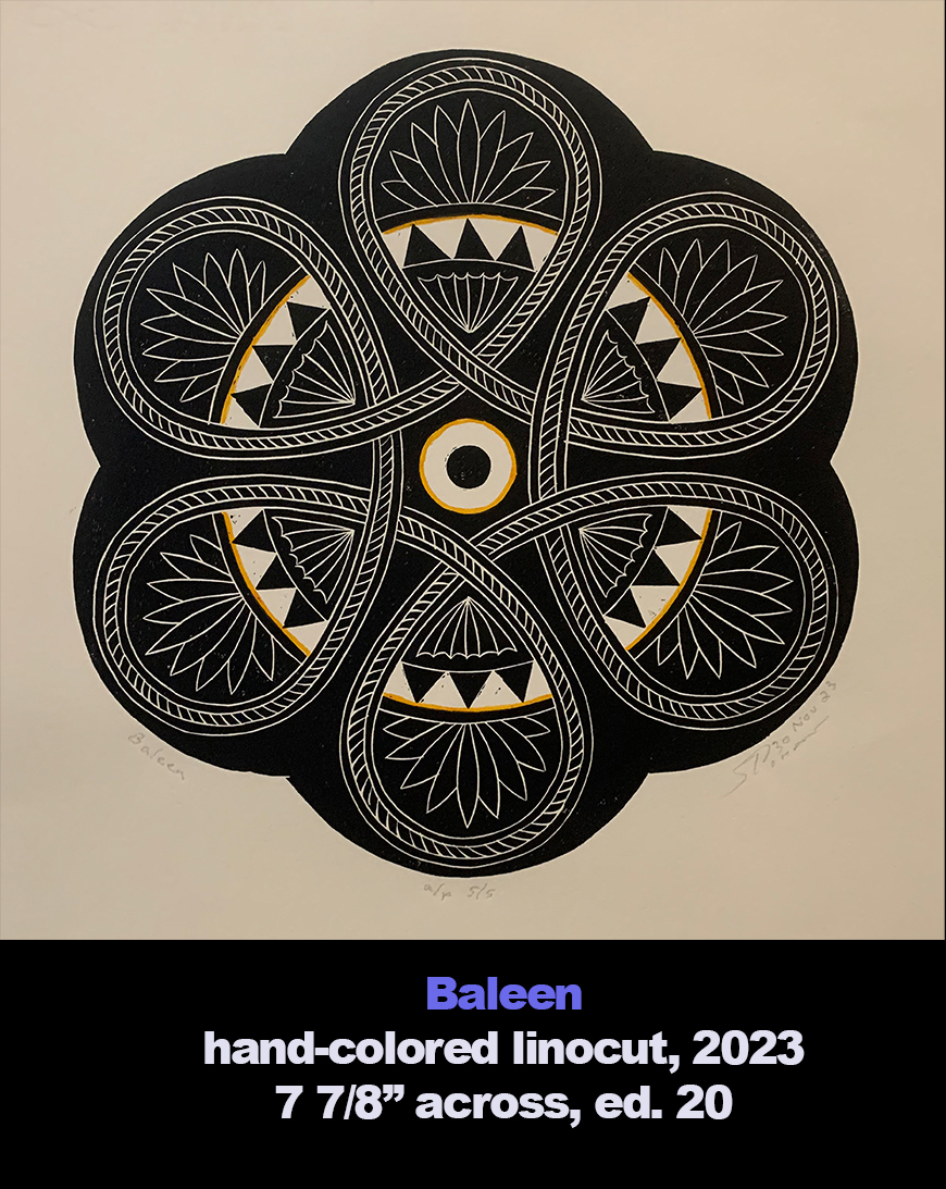
Baleen
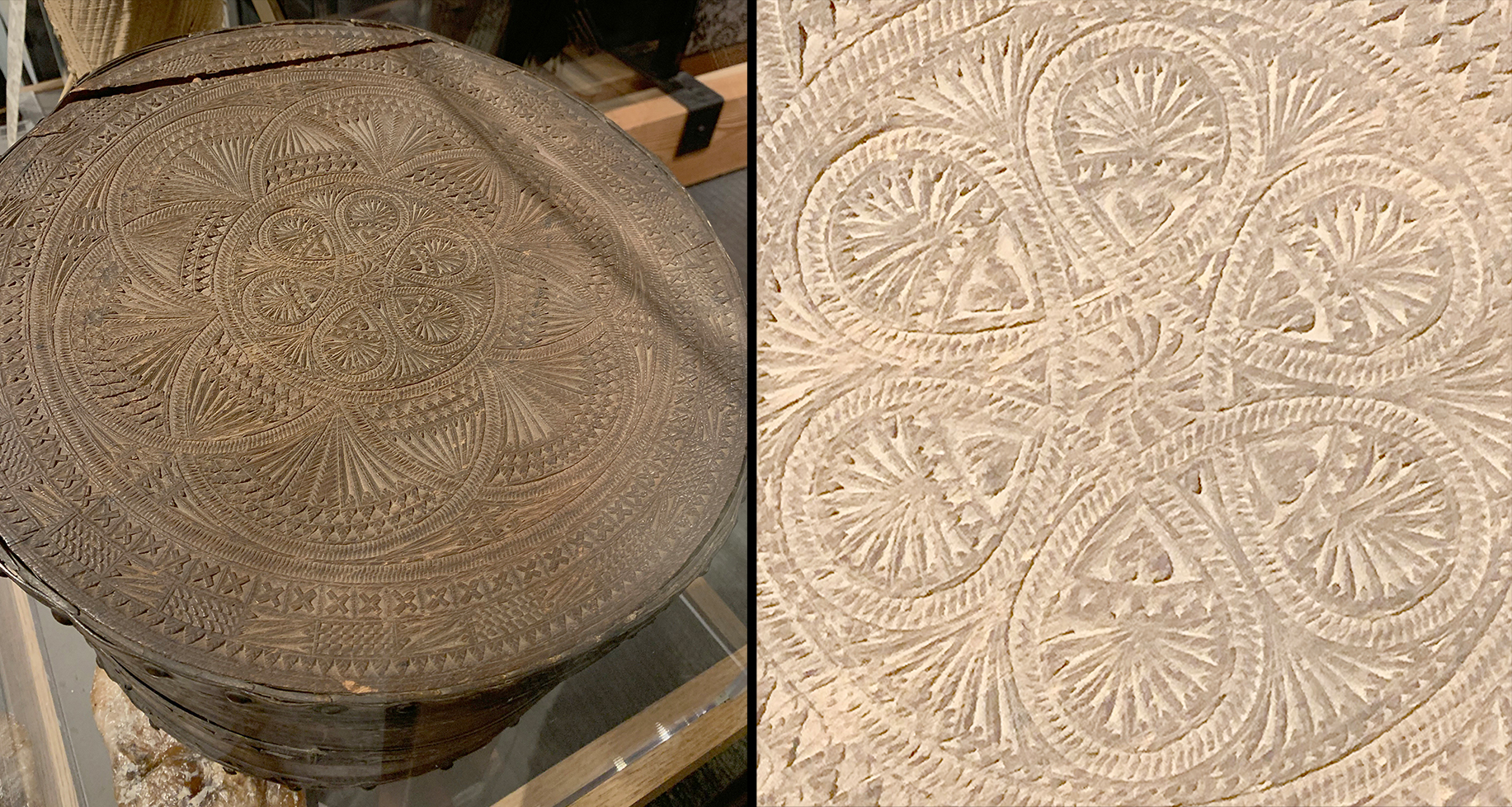
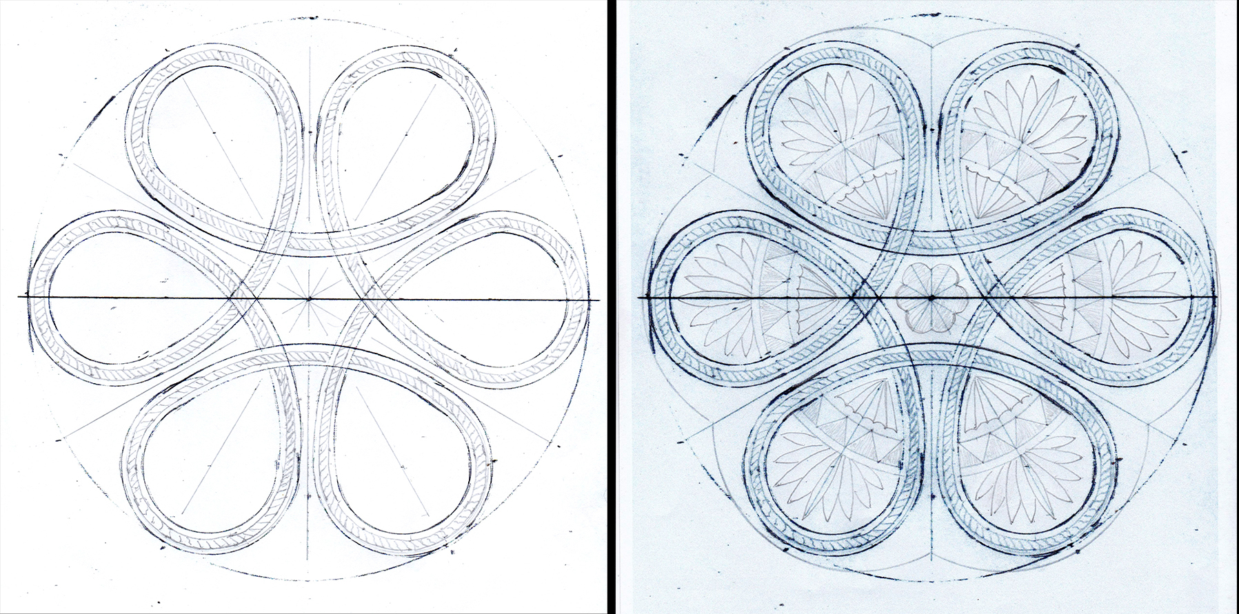
A visit in October 2023 to the Mystic Seaport Museum, Mystic CN, led to the creation of my linocut “Baleen.” In its whaling exhibition was this hatbox made of woven whale baleen. It’s listed to having been Dutch made from about 1655. Here it is with my Photoshop attempt to convert its view into a shape I could copy.
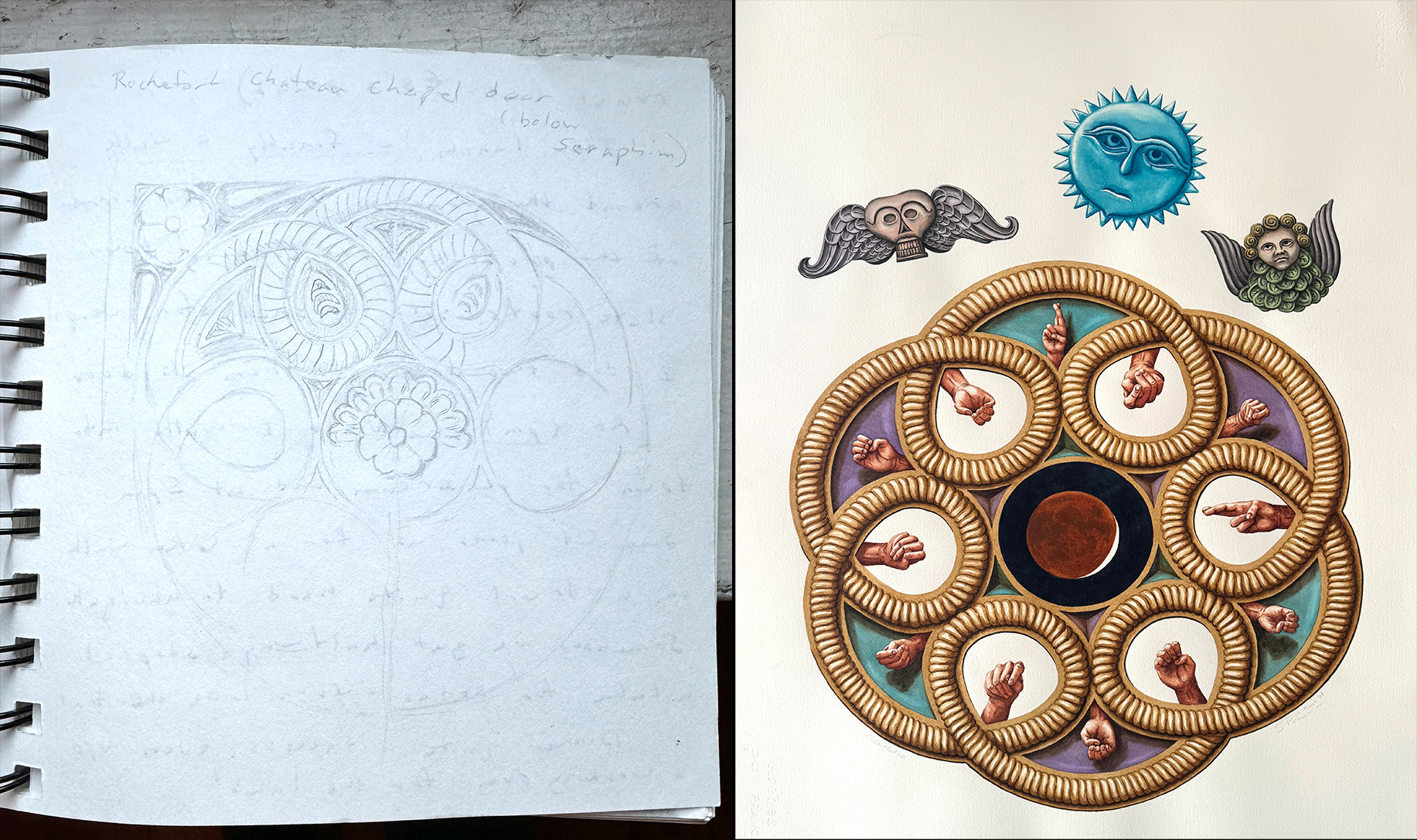
The center design with its circle of six loops instantly brought me back to 2007 when I enjoyed an artist residency in Rochefort en Terre courtesy of the The Alfred and Trafford Klots International Program for Artists sponsored by the Maryland Institute College of Art. The program was suspended in 2023. I was so sure I had used that looping circle before.
To my surprise the loops of the pattern I sketched from the carved door of the chapel on the grounds of the chateau where the residency was held were inverted compared to the hatbox loops. They faced inward while the hatbox loops faced outward. I used the chapel door pattern for my watercolor “Oscillation” in 2008. It measures 30″ x 22″. The hands can be read in American sign language.
Once again I needed to recreate on paper the hatbox loops. Then I adapted hatbox elements to fill out the design.
Black Doves
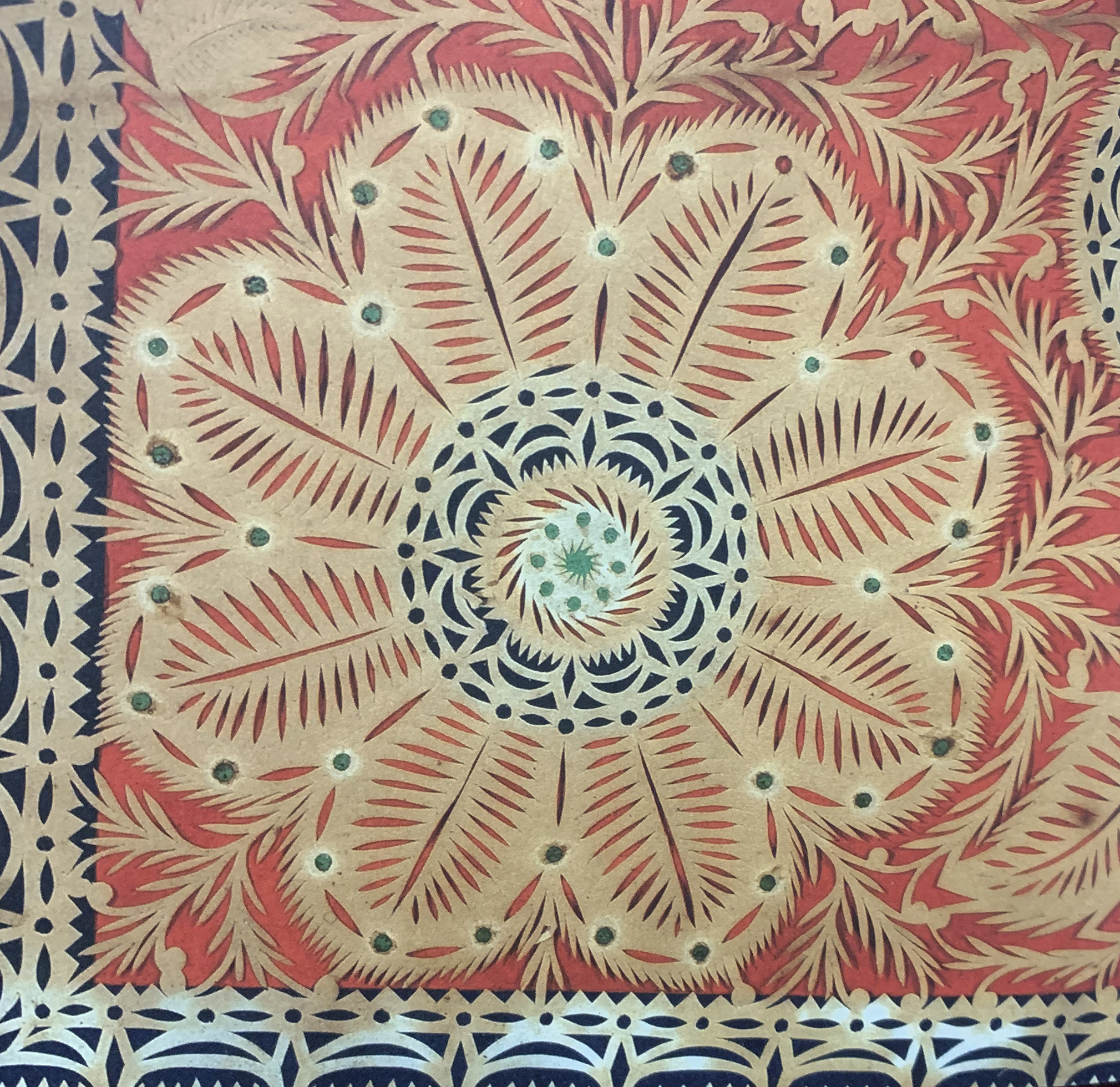
The inspiration for “Black Doves” arrived in 2023 thanks to first annual edition of “Americana Insights.” According to co-editor Lisa Minardi: “Americana Insights is an interdisciplinary publication dedicated to advancing the study of Americana and traditional American folk art.” One essay in particular attracted my attention. “Tributes in Paper from the City of Brotherly Love” by Deborah M. Child. She contended that Abraham Eldred (c. 1794-1854) made a series of cutworks while incarcerated in Philadelphia prisons.
The image (right) is of the lower left corner from a cutwork, c. 1836, inscribed to “Elizabeth Williams.” The whole piece measures just 9 3/4″ x 15 3/8″ and is composed of cut paper on a colored paper backing. In April 30, 1836, Abraham Eldred began a six-year sentence for larceny at Eastern State Penitentiary in Philadelphia. Henry Jonathan Williams at the time was the legal adviser to the prison’s warden Samuel R. Wood. The article doesn’t list the relationship between Elizabeth and Henry Williams. There is another cutwork that was made for Julia Rush Williams, who was Henry’s wife. The complete article can be read online (LINK).
My initial sketch was quite literal to the Eldred cutwork. The doves were adapted from a cutwork inscribed “Eliza Tage, 1832.”
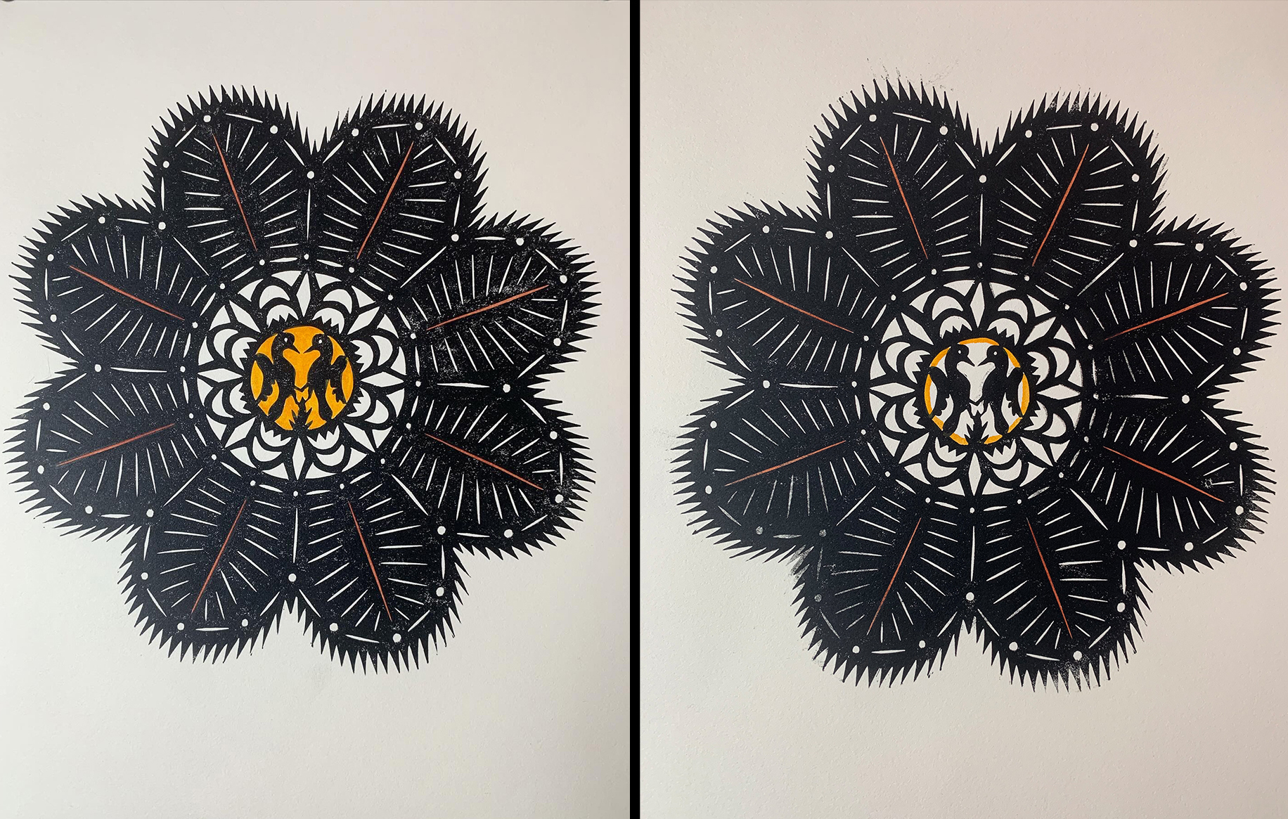
From the very first linocut hand-coloring with watercolor had become the last decision needed for each linocut. Sometimes I knew before pulling the first proof where the hand-coloring was to go. More often I didn’t decide until I colored some early proofs. Here are a pair of trials. I’ve even posted on social media asking folks what they preferred. It was fun to read responses. The one with the solid yellow center receives a lot of votes, but I chose:
BAKEWELL
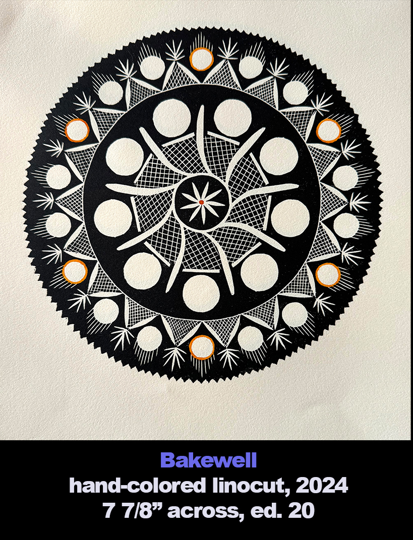
Glassmaking became a big industry in the Midwest along the Ohio River. Pittsburgh is often cited as the epicenter of that industry. The first glass house opened in 1797. And the best known manufacturer there carried the name Bakewell. The founder was Benjamin Bakewell (1767-1844), who arrived in Pittsburgh in 1808. Quoting from “Pittsburgh Glass 1797-1891” by Lowell Innes: “Bakewell had no experience in glassmaking, but he was an able administrator and superb salesman. By his selection of craftsmen, his company was to produce glass that won the highest regard of buyers in the nineteenth century.”
The cut and blown Pittsburgh glass that attracted my collecting jones was made from about 1815 to 1840. I cannot say any of my pieces were made by Bakewell and the several iterations of the Bakewell firm. But Pittsburgh was a likely location for their manufacturing.
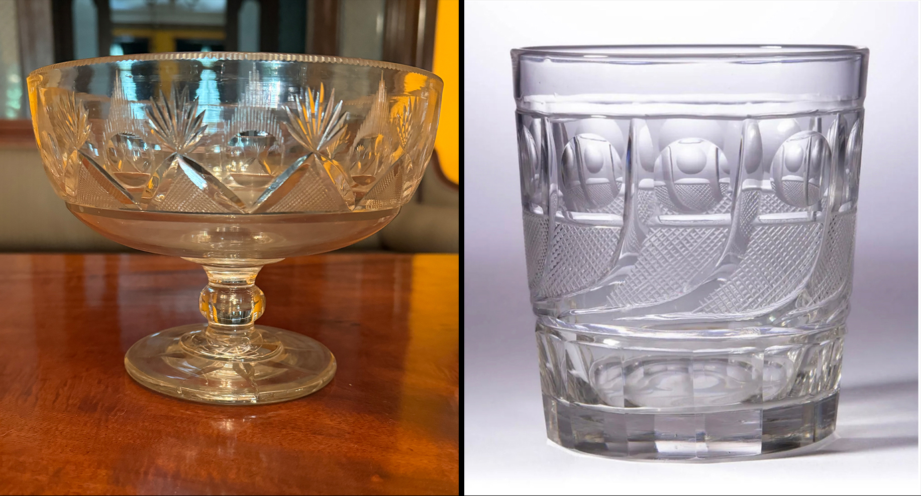
This compote of mine, about 8″ across and 6″ high, was a natural source for a linocut border. The components carry names like strawberry diamonds for the cross-hatched triangles, roundels for the circles, rays for the lines emanating from the circles and fans atop the strawberry diamonds. It may have been made in the 1835-45 range. The other piece, a tumbler, I don’t own, but it has a repeating pattern that’s called a comet. Tumblers tend to be about 3 1/2″ high. It could be dated to 1835-1850. Haley’s Comet, which appeared in 1835, was its inspiration.
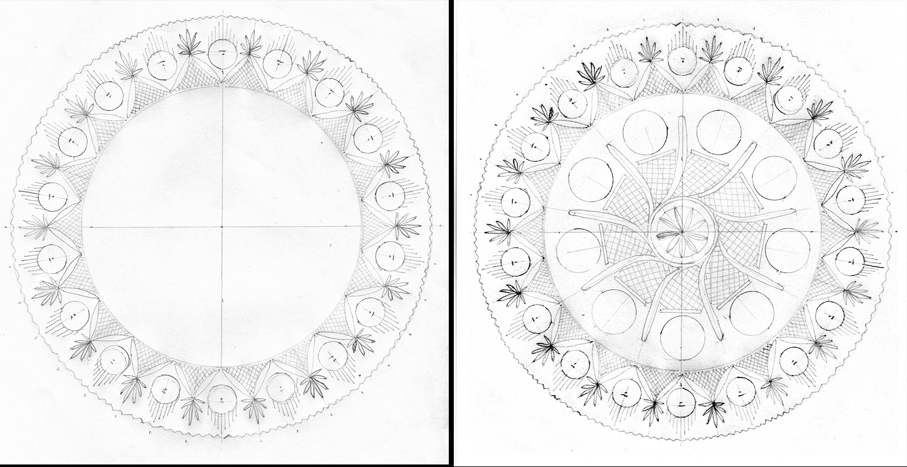
First I worked out the repetitions of the compote border needed to fill a 90 degree arc (or a quarter circle). Once I was satisfied, I cloned that arc via Photoshop into a complete circle. Then I turned to the tumbler’s comet pattern to fill the insides.
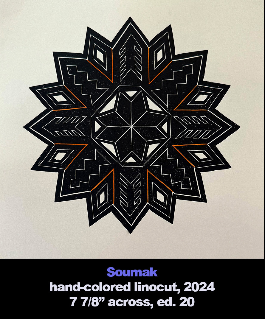
Soumak
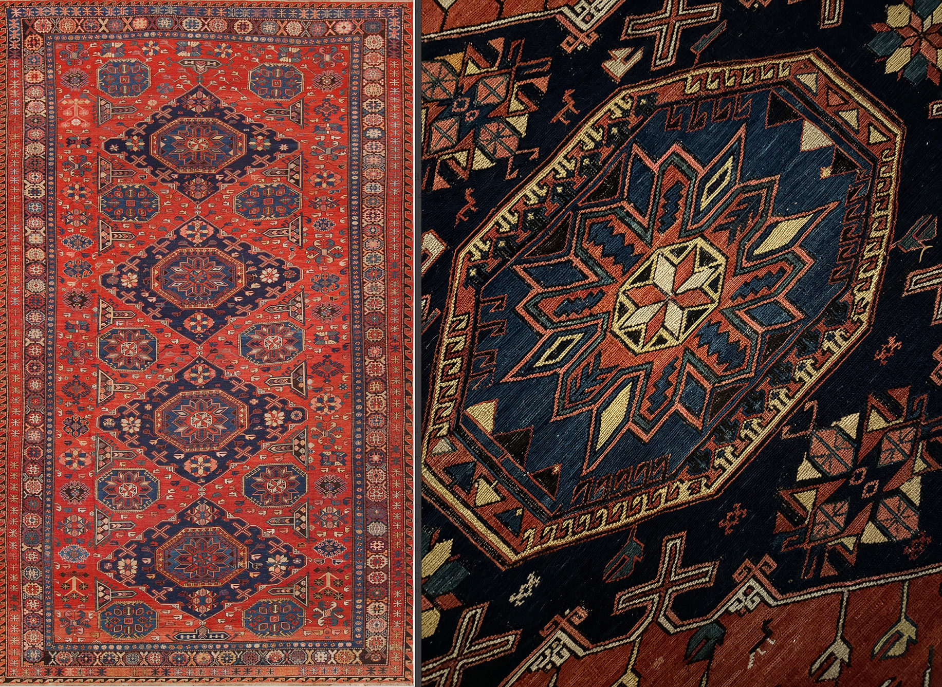
My first glimpse of “Oriental” tribal carpets came in 1979 during my first visit to Morocco. Hanging above the entryways of every carpet shop were flat weaves where the design was not woven as you would do a blanket, just warp and weft. The colorful patterns were created by adding extra weft, leaving loose ends on the underside. I bought two in my first Moroccan visit and more, larger ones during my second and third trip. Simply said I was smitten with kilims. Then during my first visit to Istanbul I added a type generally called a soumak with another variation of weft wrapping. But I couldn’t match it in tribal rug reference books. There I did see soumaks made on the western shore of the Caspian Sea, mostly around the region of Azerbaijan, part of Caucasian region. One day I told myself a real soumak would grace our house if I could find and afford one from the early 20th century.
I never dreamed that I would end up with one over 14 feet long thanks to an auction this spring in New York. Not surprisingly, the center part of the four large diamond shapes instantly became the catalyst for another linocut.
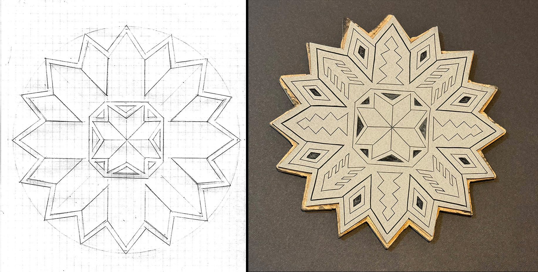
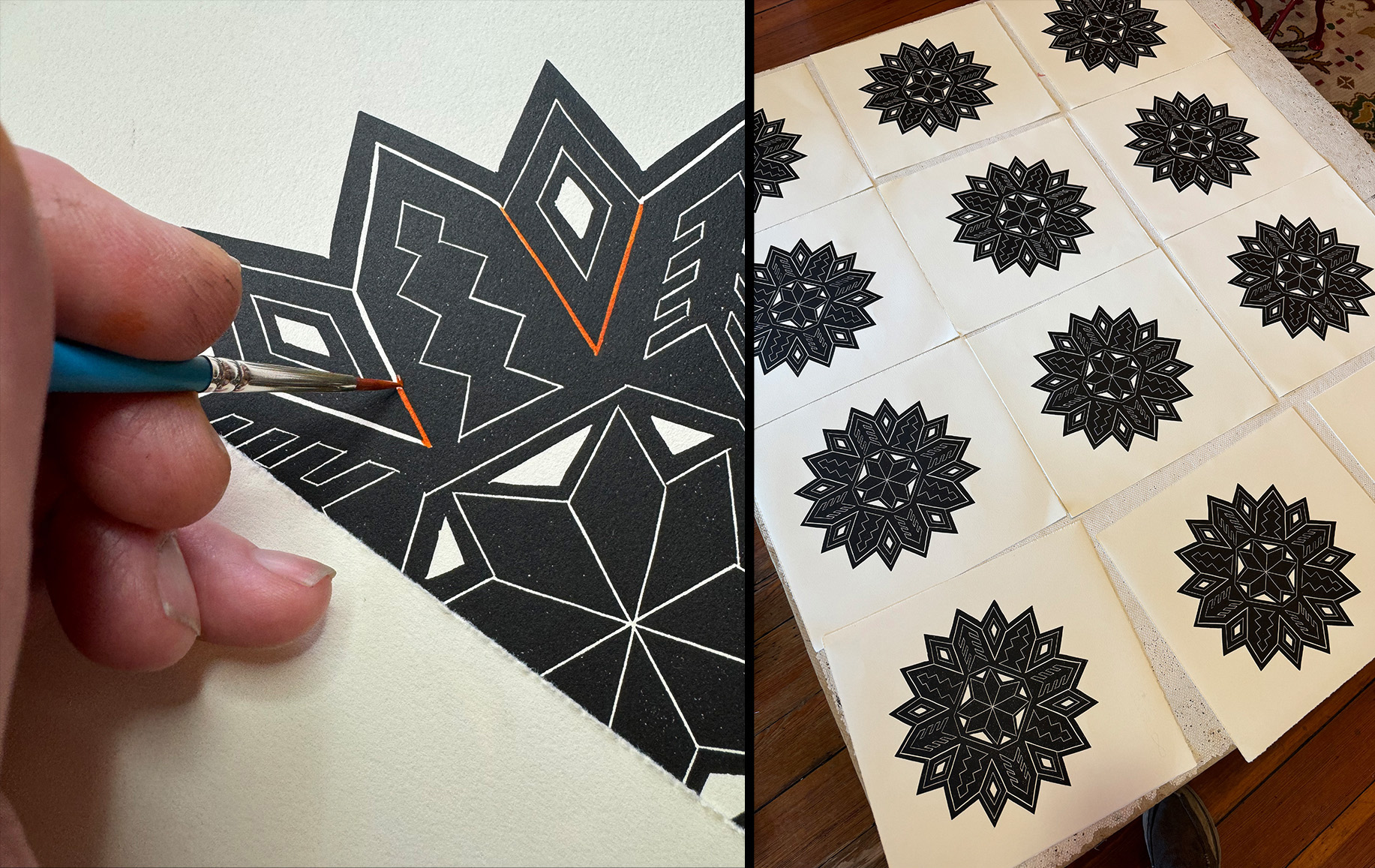
The first task was to make that soumak medallion circular. Then I added the arrow shapes, the lightning bolt shapes, diamonds and the tree shapes in accordance to the medallion. This you can see on the used linocut block. The black areas were recessed areas that printed white. They darkened during cleanup, leaving traces of ink. In a way this linocut was quite true to it source.
To the right are twelve newly printed linocuts. The hand-coloring with watercolor happened after they had dried a day.
Almora
For “Almora” I found myself mining my photo archives, this time for ones taken during a 2015 artist residency in Uttarakhand, a northern state of India, sponsored by PECAH (Programme of Exchange in Culture and Art of Himalayas). My very first linocut “Aipen Mum” was also inspired by that journey. (To read about “Aipen Mum,” please consult my first linocut blog post: LINK)
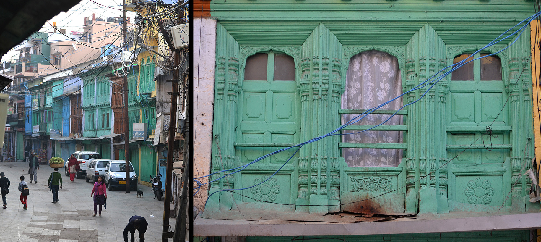
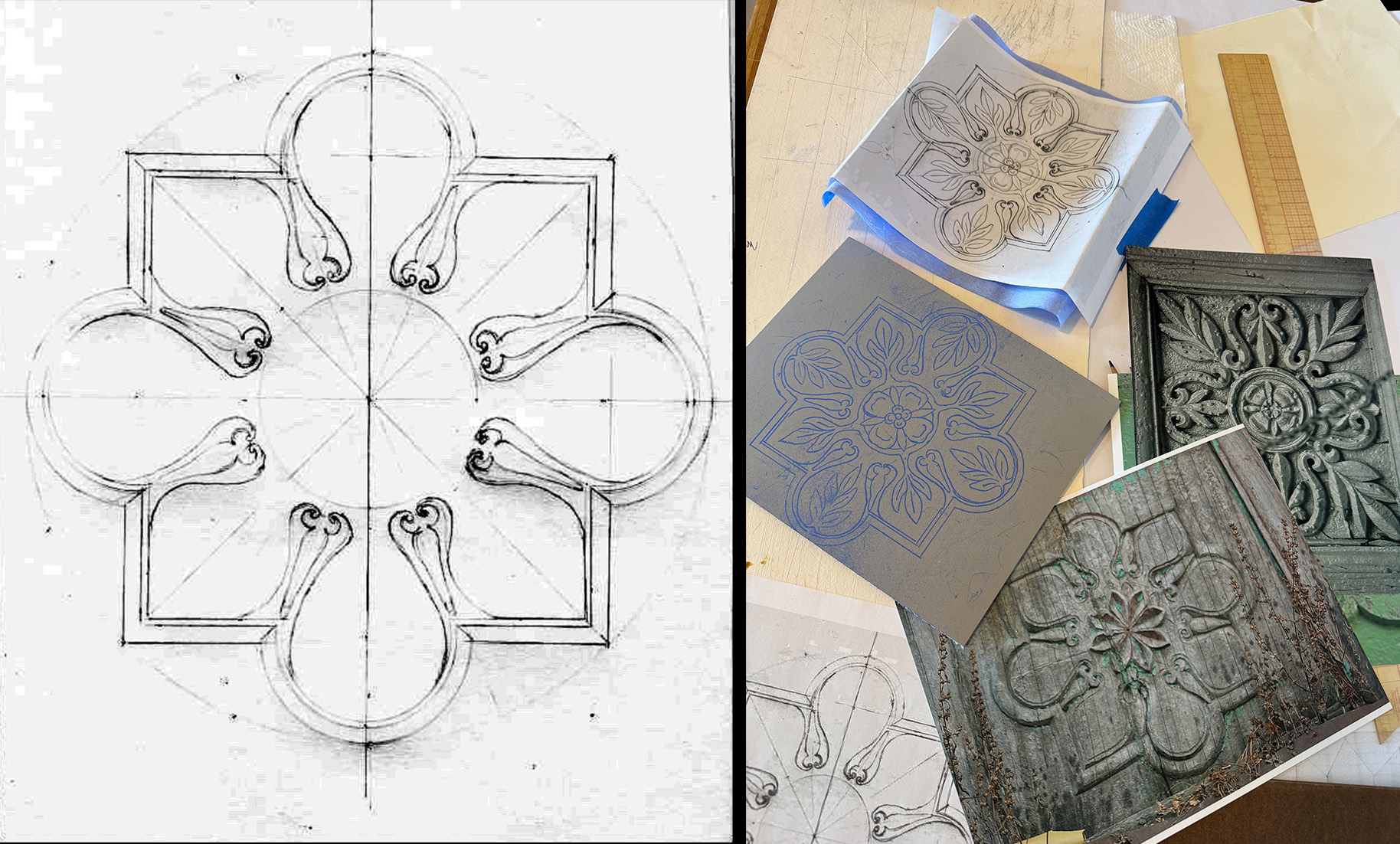
Almora, a small city perched on a ridge, had a bustling bus-filled commercial street and a forlorn mostly pedestrian commercial street. The latter, shown above, had wooden facades, storefronts on the ground floor and wood carvings that beautifully enhanced the residential floors above. Layers and layers of paint hid the wonderful reliefs, many in poor condition.
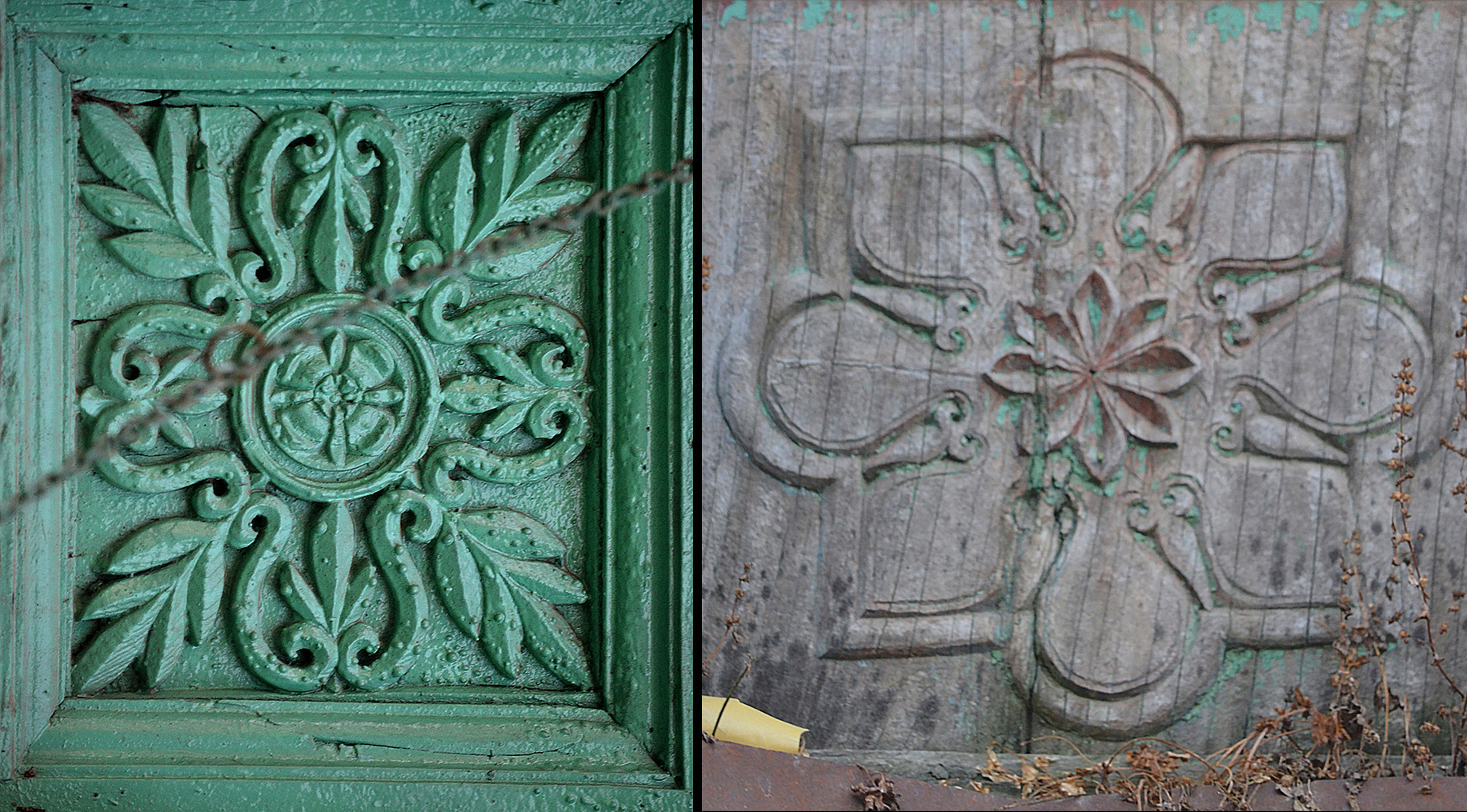
Here are two of the panels from that street. The one on the right seemed to be carved from the solid wood. It would give the “Almora” linocut its overall shape. The one on the left appears to have its leafage and center flower carved separately and applied to the wood panel. Its foliage would fill the arches in the design, and the flower would fill the center.
Here is the design with just the pattern from the right-hand photo minus its center flower. The photo on the right includes (top) the finished design still taped to the transfer paper. Center left is the linoleum block with the transferred pattern in blue.
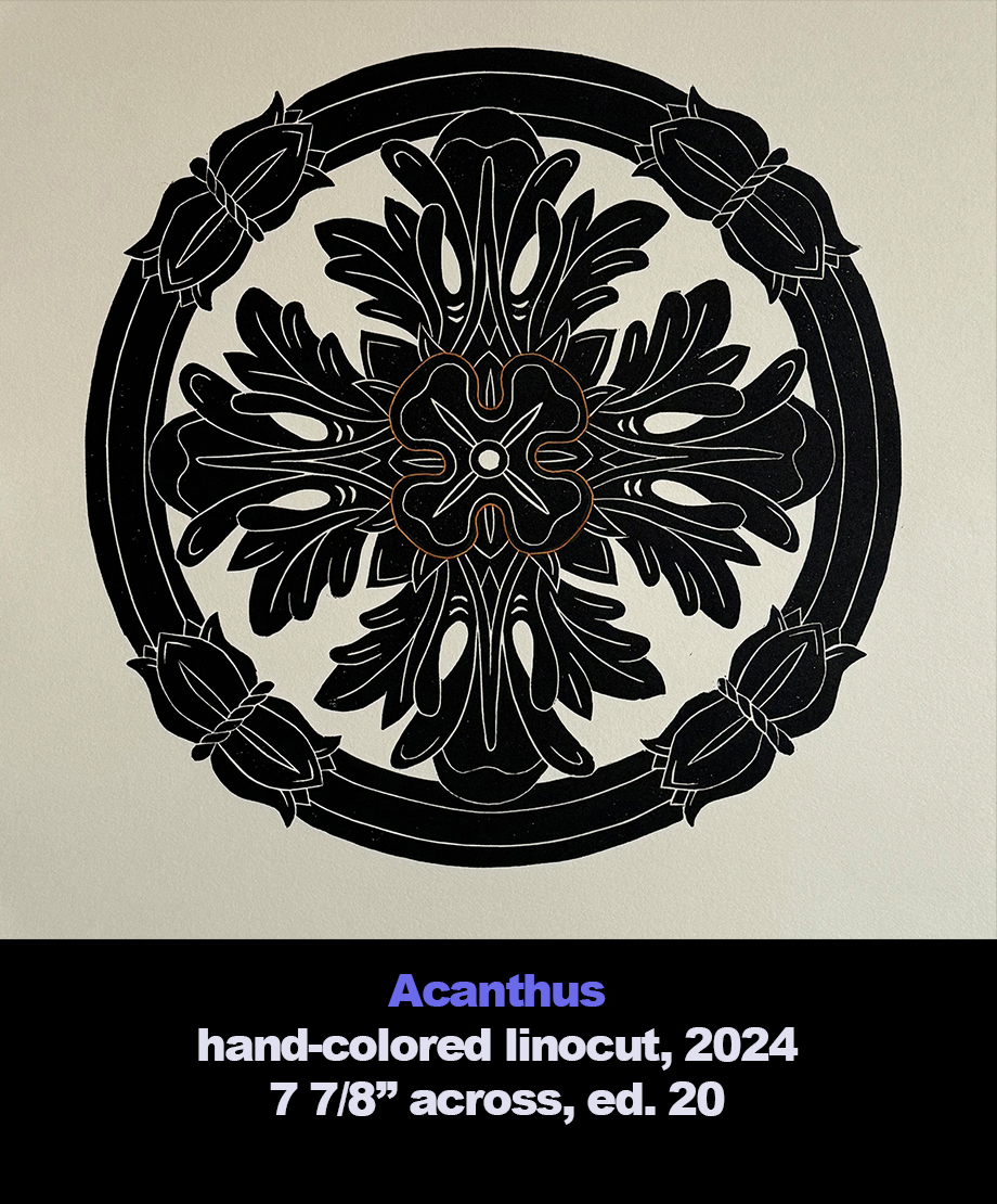
Acanthus
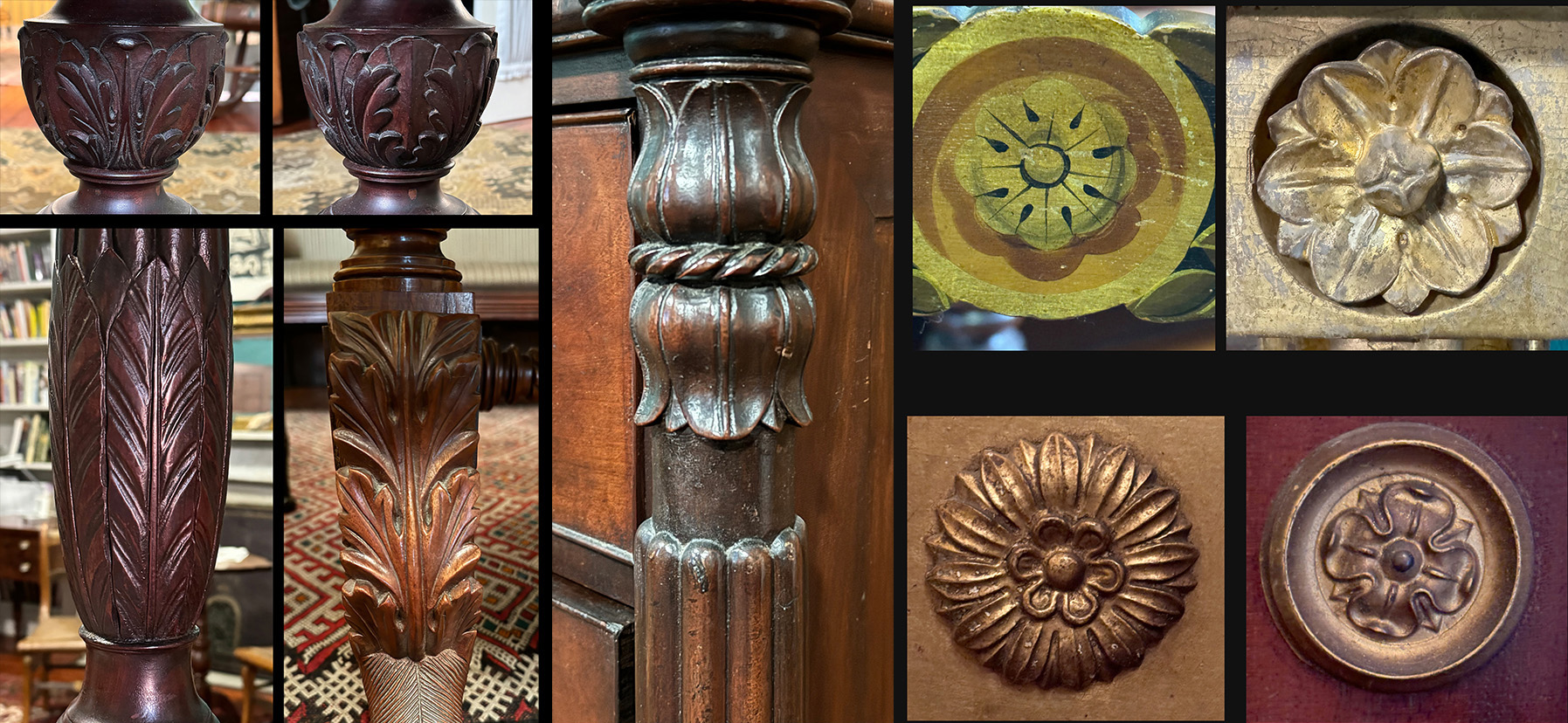
“Acanthus”–like “Bakewell” and “Soumak”–was a product of me just looking around at some decorative arts items I’ve come to live with. In the case of “Acanthus” it was the house’s furniture, which was crafted in the early 19th century and American made.
These are details of some of the objects I photographed. The pair of upper left photos are from the carved pedestal of a small table. The bottom left image is from a tall-post bed’s foot post. Beside it is from the leg of a drop-leaf trestle table. In the center the back-to-back flowers is from the corner of a chest of drawers. Of the four rosettes the top left one is from a medial rail of a painted chair. Beside it is a carved flower set into a corner block of a gilt mirror. The bottom two rosettes are stamped brass bosses also for mirrors.
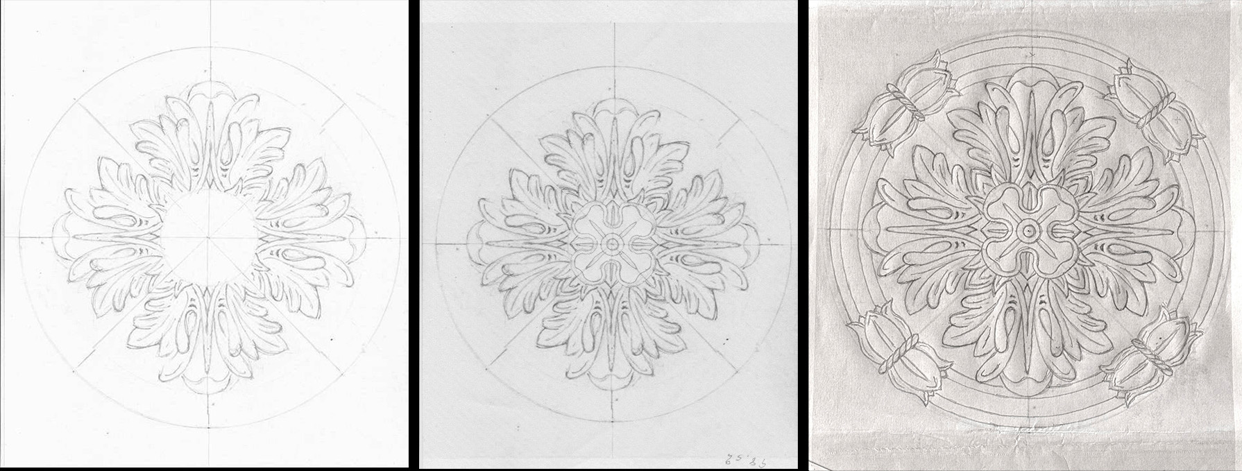
I began by sketching the acanthus leaf carving from the small pedestal table in a 90˚ section of a circle, then repeating it three times in Photoshop to complete the circle. I then added one of the mirror bosses. Finally I drew four pairs of flower buds from the chest of drawers.
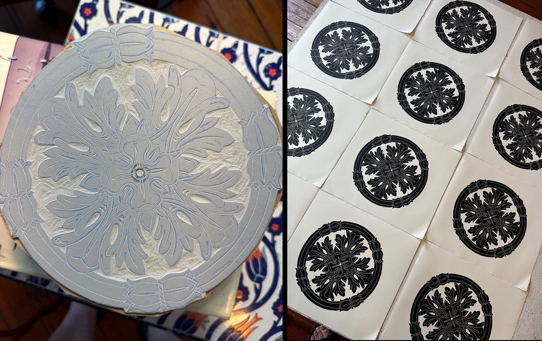
This design required me to make the most extensive removal of linoleum in the linocut series so far. Here is the “Acanthus” block before proofing. The areas that are not to receive ink (and stay paper white) have been sculpted out. You can easily see tool marks. The parts with the acanthus leafage are defined by the cutaway areas, thus making this part of the design black-line work. On the right is a table full of newly printed “Acanthus” linocuts. They have not received their watercolor coloring.
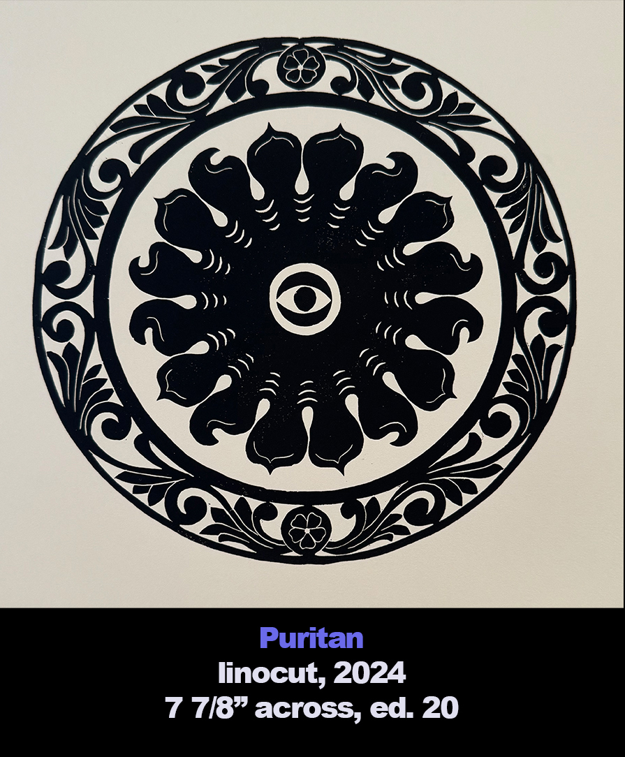
Puritan
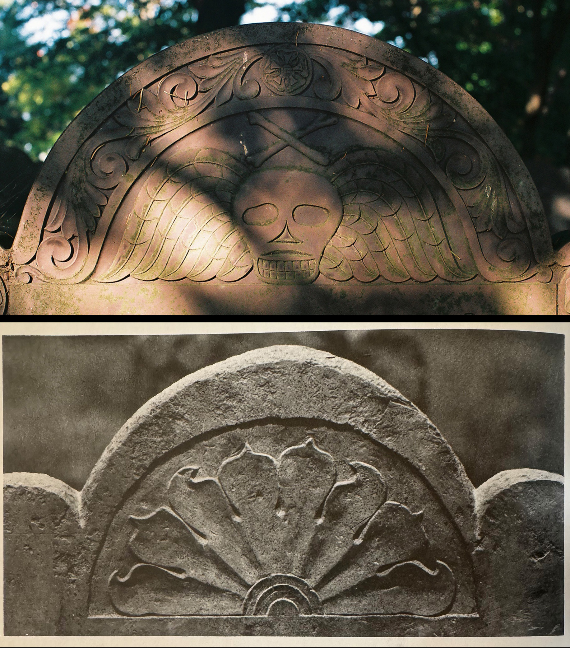
One of the unexpected delights of visiting my friend Karen Klein either at her Cambridge MA house or her Mashpee house on Cape Cod was the exposure to cemeteries in Eastern Massachusetts with pre-1800 tombstones. They were alive with all types of fanciful death imagery, seemingly out of the Middle Ages. So as I was mining my data banks for inspiration for yet another linocut, it shouldn’t have been a surprise that I would eventually focus on these stones.
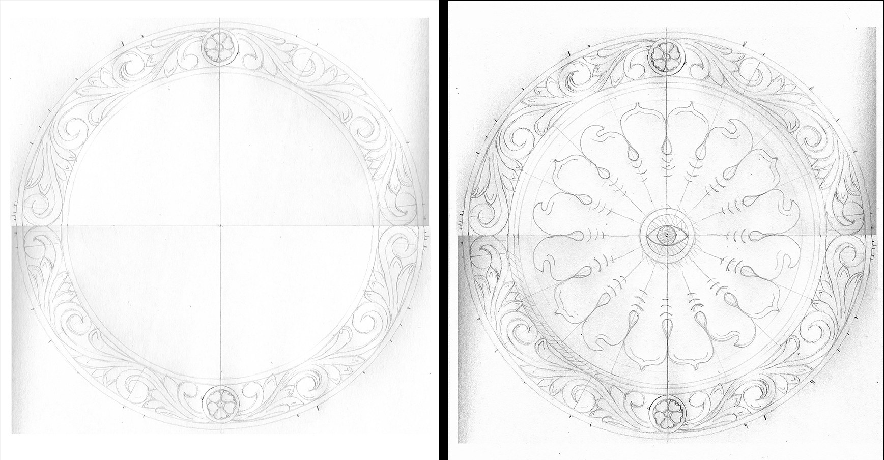
The top image is typical of pre-1800 grave makers with its foliate boarder and winged skull. (Unfortunately I can’t place its location.) I used its border for the “Puritan” linocut. For the center component I flipped through the book “Graven Images: New England Stonecarving and its Symbols, 1650-1815” by Allan Ludwig. This photo is from a stone in Malden MA dated 1678. I really liked its flattened petals where on other stones rays of the setting sun would be.
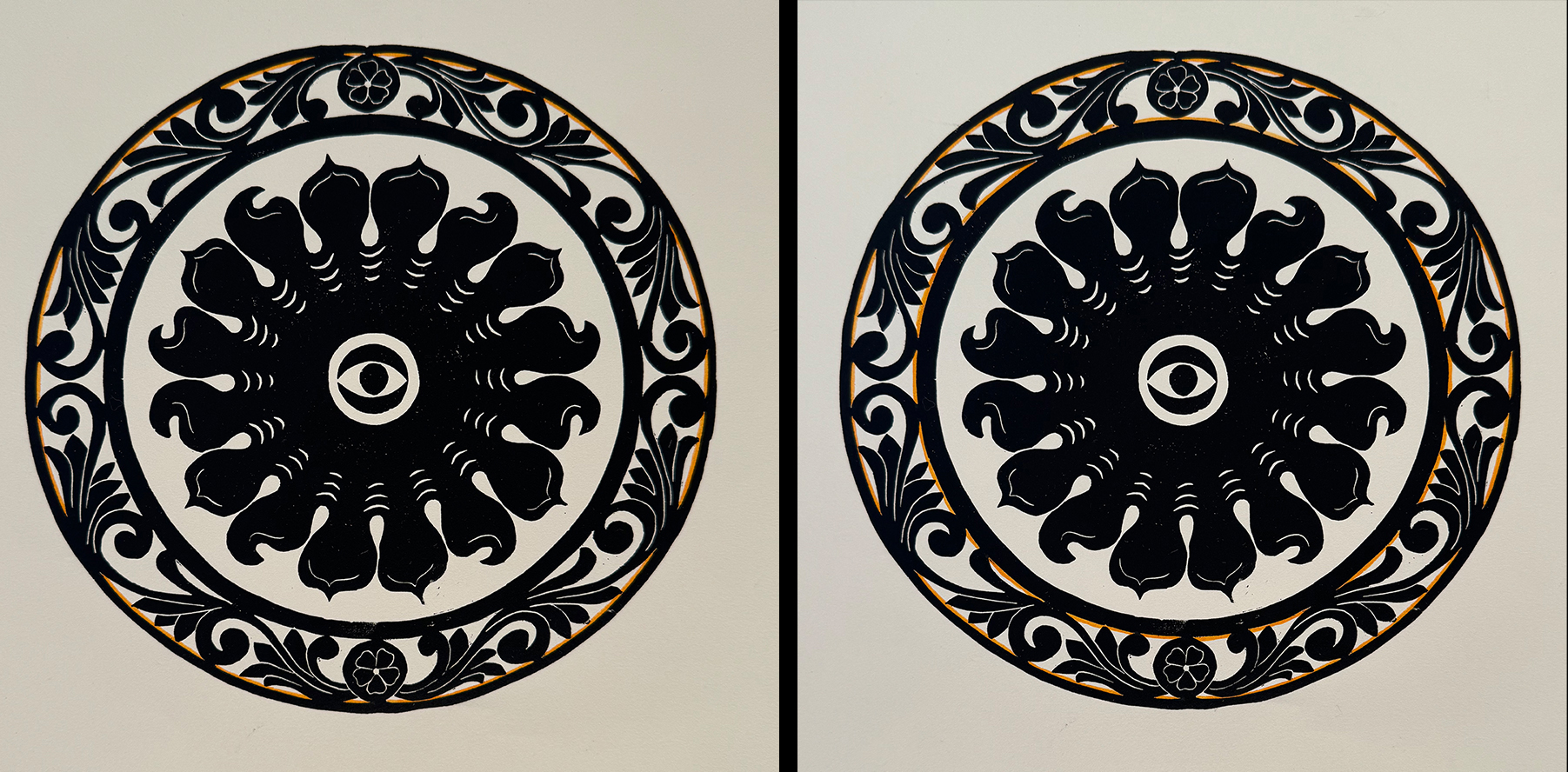
For the center element in “Puritan” I placed an eye in reference to the winged tombstone cherubs that appear instead of winged skulls on many stones.
You can see that I drew half of the border then duplicated it by flipping it over. Then I drew the center motif and the eye. I had no idea at the time that the eye when printed out would to mimic the CBS eye. I may yet change it for the book Karen Klein and I are working on.
As had been my custom, I tested out some hand-coloring options but for the first time decided against it.
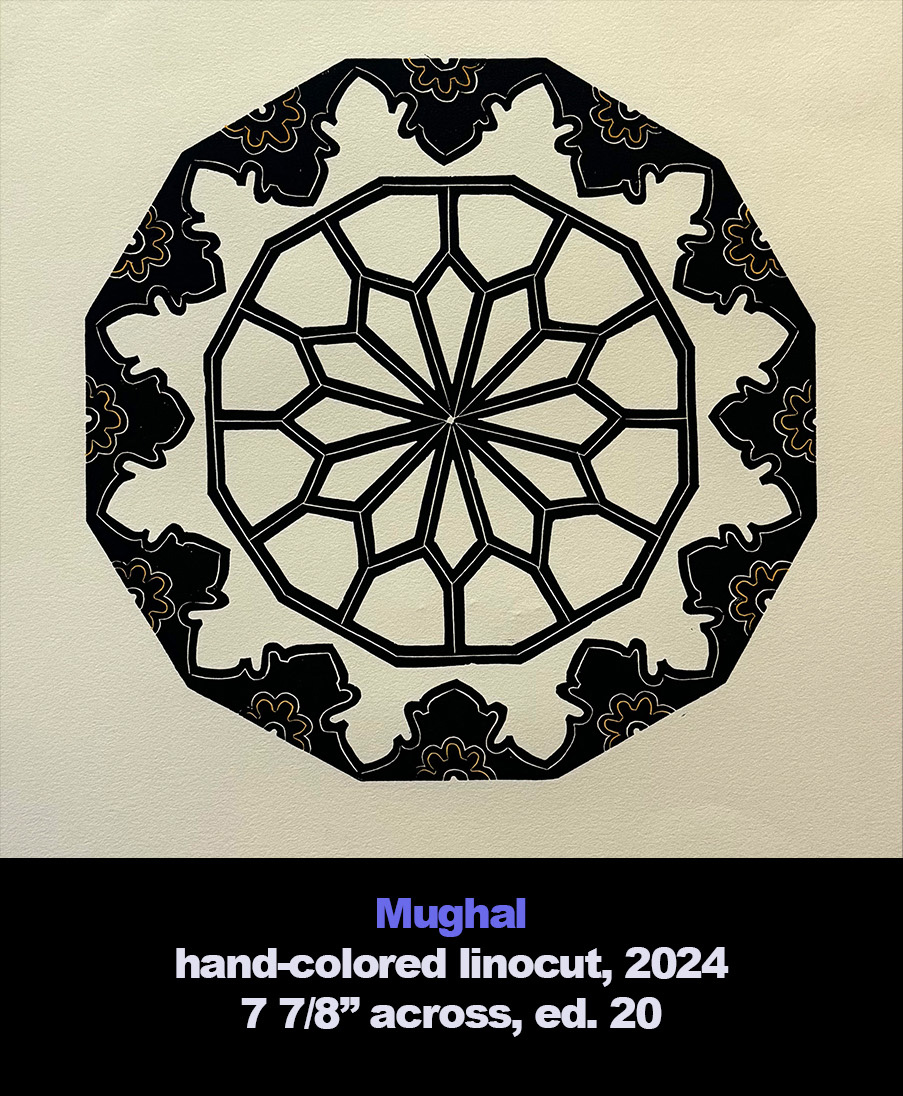
Mughal
For the third time I turned to my 2015 trip to India for a linocut image. Unlike for “Aipen Mum” and “Almora,” the source material for “Mughal” was experienced after I left the artist residency early because I needed to go to New Delhi to fix a visa problem. This turned out to be a great opportunity not only to see sites in the city but to spend a day in Agra to see the Taj Mahal and the Red Fort, both built during the Mughal Empire.
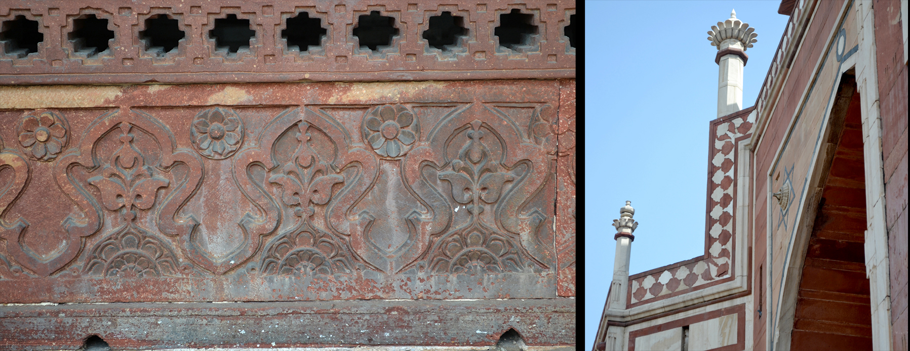
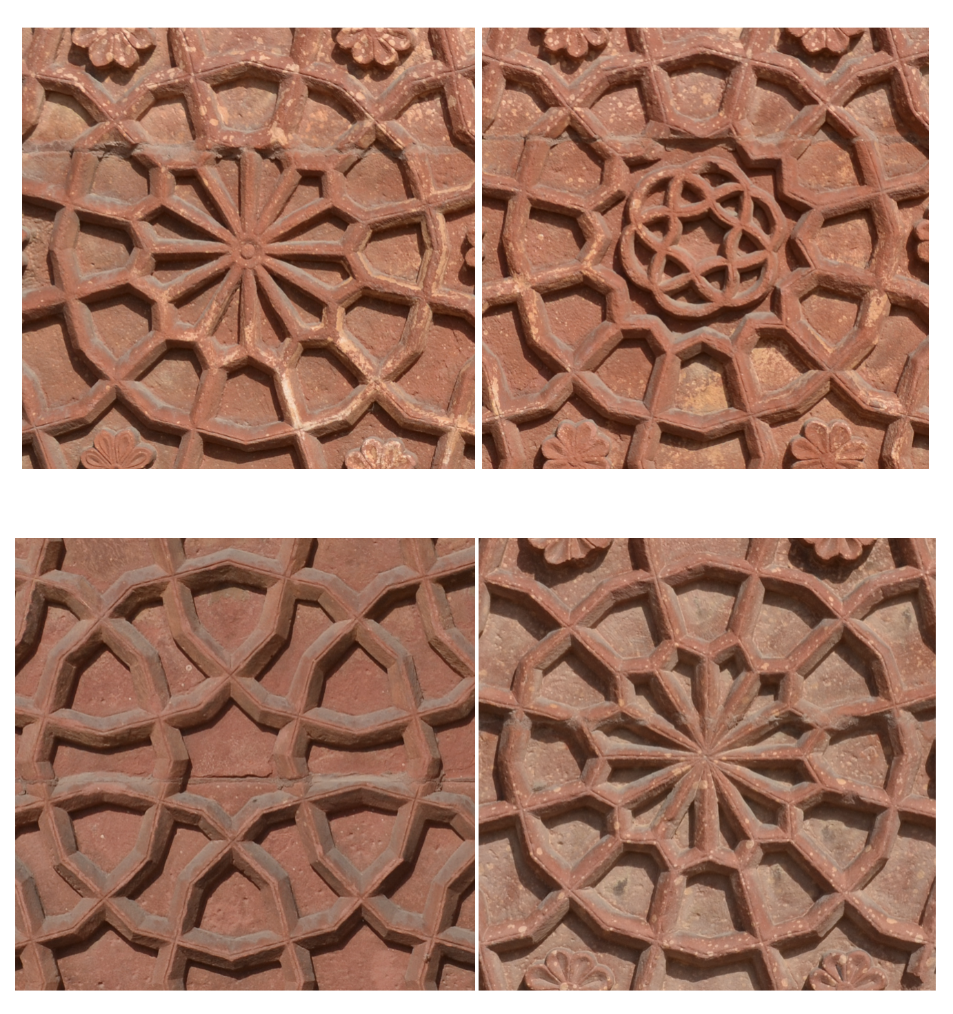 The Red Fort got its monicker appropriately enough since it was largely composed of red sandstone. Here are parts of four variations of the stone reliefs from the facade of the Red Fort. Needless to say, one of these would be the heart of the new linocut.
Looking for a border I found the answer in New Delhi at the grounds of Emperor Humayun’s tomb, which was built by his widow from 1565 to 1572. It predates the Taj Mahal. The photo on the right is from that mausoleum. I like that reversing leaf pattern. On the same grounds was the Isa Khan Tomb, which was built 20 years before the Humayun tomb. It had a more fully articulated version of the same reversing pattern.
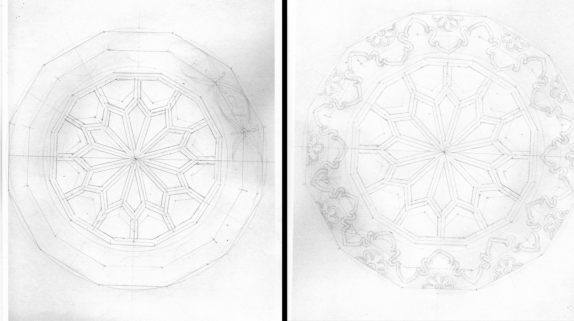
In this case I first created the geometry for the center bsaed on one of the Red Fort reliefs. At first I was going to pair it with a border of Hindu Goddess Lakshmi’s footprints out of the Aipen folk art tradition. You can see a bit of that attempt on the upper right. But I wasn’t comfortable with it. The Mughal reversing leaf pattern seemed a more companionable fit.
Gorgon
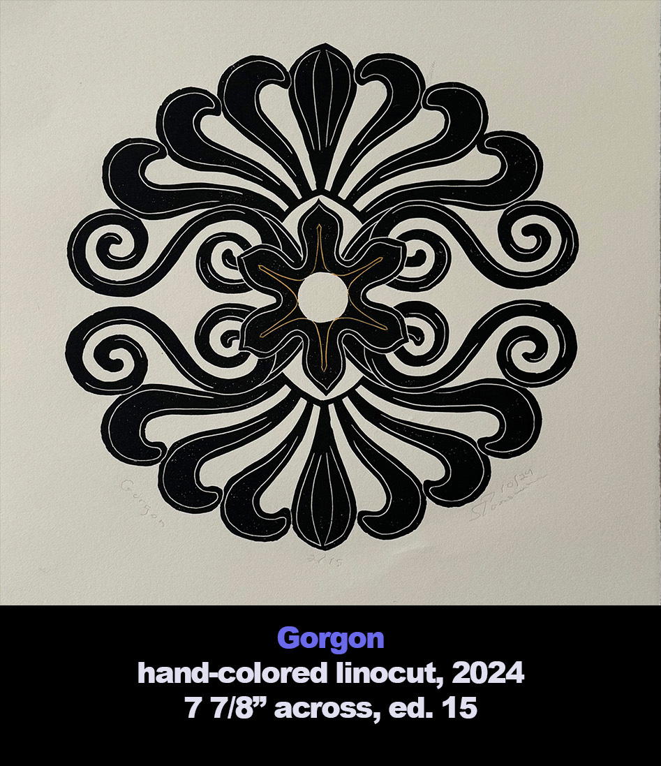
The 15th linocut in the series turned out to be an exercise in reduction, i.e. less was more.
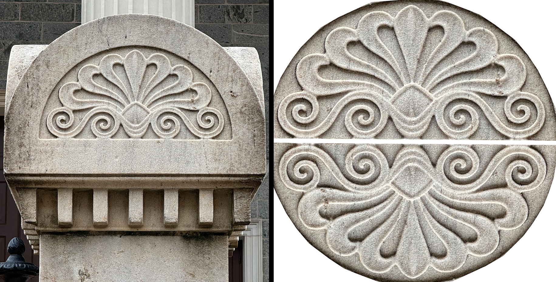
Wanting to go full Greek revival, I walked over to the Basilica of the Assumption, America’s first cathedral. Designed by Benjamin Henry Latrobe, it opened in 1821. But it wasn’t the church itself that had caught my eye, rather the anthemions carved atop of the marble posts that connect the cast iron railings that surround the grounds. So I began my design by simply placing one copy of the anthemion atop another.
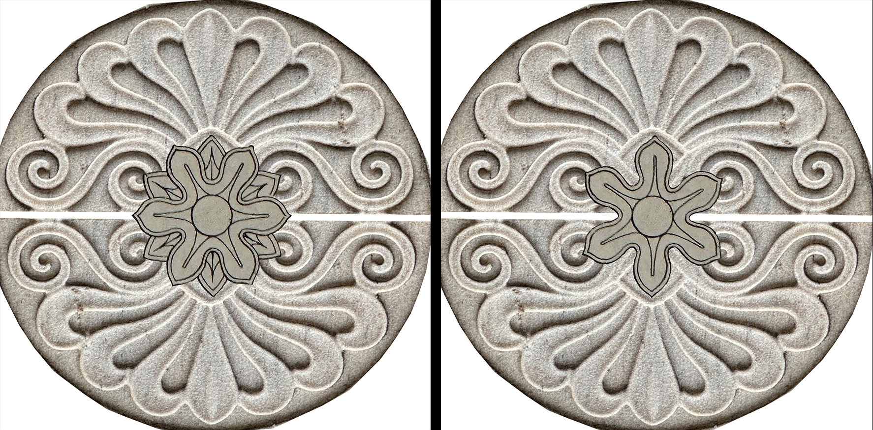
Looking for a rosette to tie the two pieces together, I leafed through a number of reprints of early 19th-century design books. I landed on the image on the left from Plate 75 of “Recueil des dessins d’ornaments d’architecture,” 1813 by Joseph Baunet. First I trimmed away the enclosing circle, and, as you will see, I eventually trimmed off the sepals peaking out between the petals.
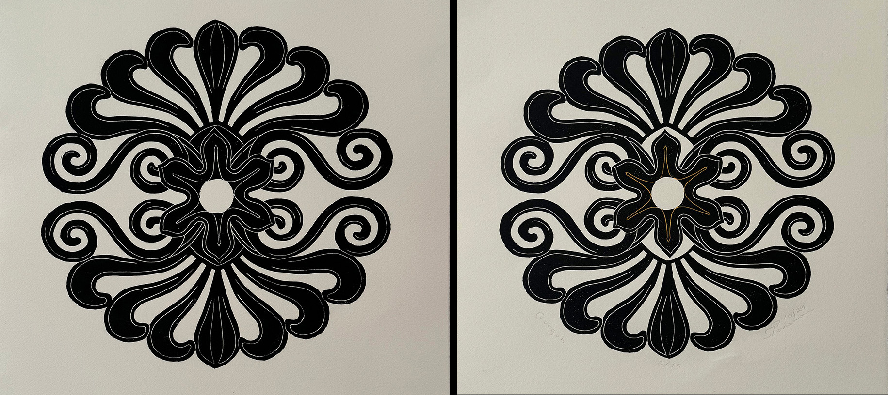
First I placed the flower with its sepals in the center of the design. It looked too busy. So I photoshopped the sepals away and tried again. It looked ready.
I thought I had reduced the image enough. But when I printed it, I thought the flower felt a bit hidden. So I cut away the linoleum block to free up two of the petals.
“Gorgon,” named for the frightful hair of the Gorgons from Greek mythology, is significant for both its reliance on black-line imagery and for its loss of any sense of border paired with a center motif.
★ ★ ★
Trackback URL: https://www.scottponemone.com/linos-5-through-15/trackback/

