Justin Remo’s Big Finale
INTRODUCTION
As introduced in my previous ART I SEE post, The Last Times On Dogwater Beach, the large-scale woodcut project by Justin Remo, a newly graduated printmaking major at Maryland Institute College of Art, was largely influenced by his adolescent years growing up in New Jersey and the distance he wanted to put between himself and the friends and the activities he engaged in with those friends during those years. If you haven’t read that blog, please consider reading it before reading this post. (LINK)
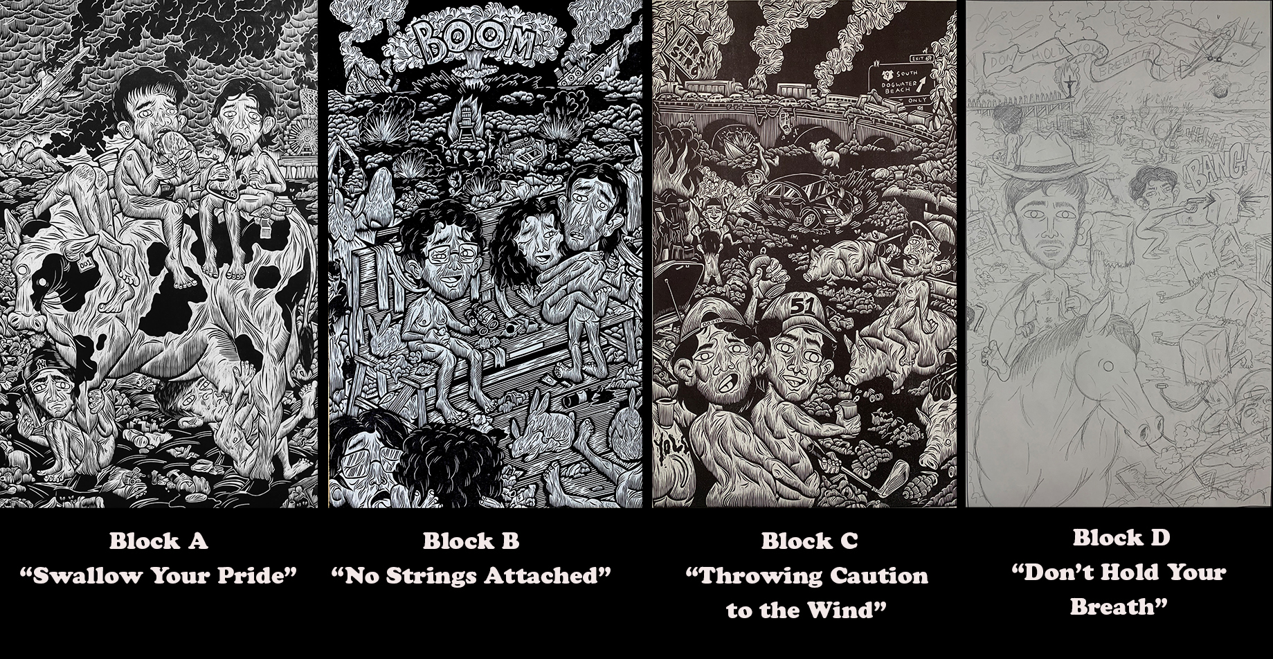
Above is a display of what he accomplished during the first semester of his senior year. He completed three of the intended four 21″ x 35″ woodcuts. (He had hoped that his second-semester mural project would have been done in time to tackle the block “Don’t Hold Your Breath” before he graduated, but he wasn’t able to.) For the sake of this post, I asked him to restate the themes of these three completed woodcuts. His response:
“The three large woodcuts featured in this series represent detailed vignettes within Dogwater Beach’s visual odyssey. Swallow Your Pride brings portraits of gluttonous consumerism alongside mindless and ceaseless consumption. No Strings Attached displays an awkwardly erotic scene of sexual repression and obsession amidst warfare beyond. And Throwing Caution To The Wind reflects the reckless and irresponsible activities endemic to New Jersey youth, almost always related to cars, drugs, or alcohol. Each of these individual prints focuses on specified exaggerated environments that expand the humorous and appalling world in this series.”
As engaging as these three woodcuts are both visually and emotionally, he wanted the focus of his thesis installation to be the mural The Last Times On Dogwater Beach, his 50″ x 91″ three-block mural. (The title Last Times On Dogwater Beach applies not only to the mural but to his entire senior thesis.)
When I asked him what is the overriding theme of the three-block woodcut mural, Remo replied:
“My colossal woodcut triptych, titled The Last Times On Dogwater Beach, is meant to be the headliner of the series, the center of everything. This mural encapsulates an expansive breadth of nightmares and memories that collectively convey a time of great change within my personal life. Carved within these three blocks are solastalgic reflections of my decomposing childhood friendships, the disheartening degradation of my home, and the rapid obliteration of our planet and the animals we share it with.”
But his answer omits reference to the large figure on the right staring out at viewers. Needless to say that figure was the subject of further questions, but let me continue this post by first seeking answers to some logistical issues regarding the decisions he made in creating such a “colossal” mural.
How he does it
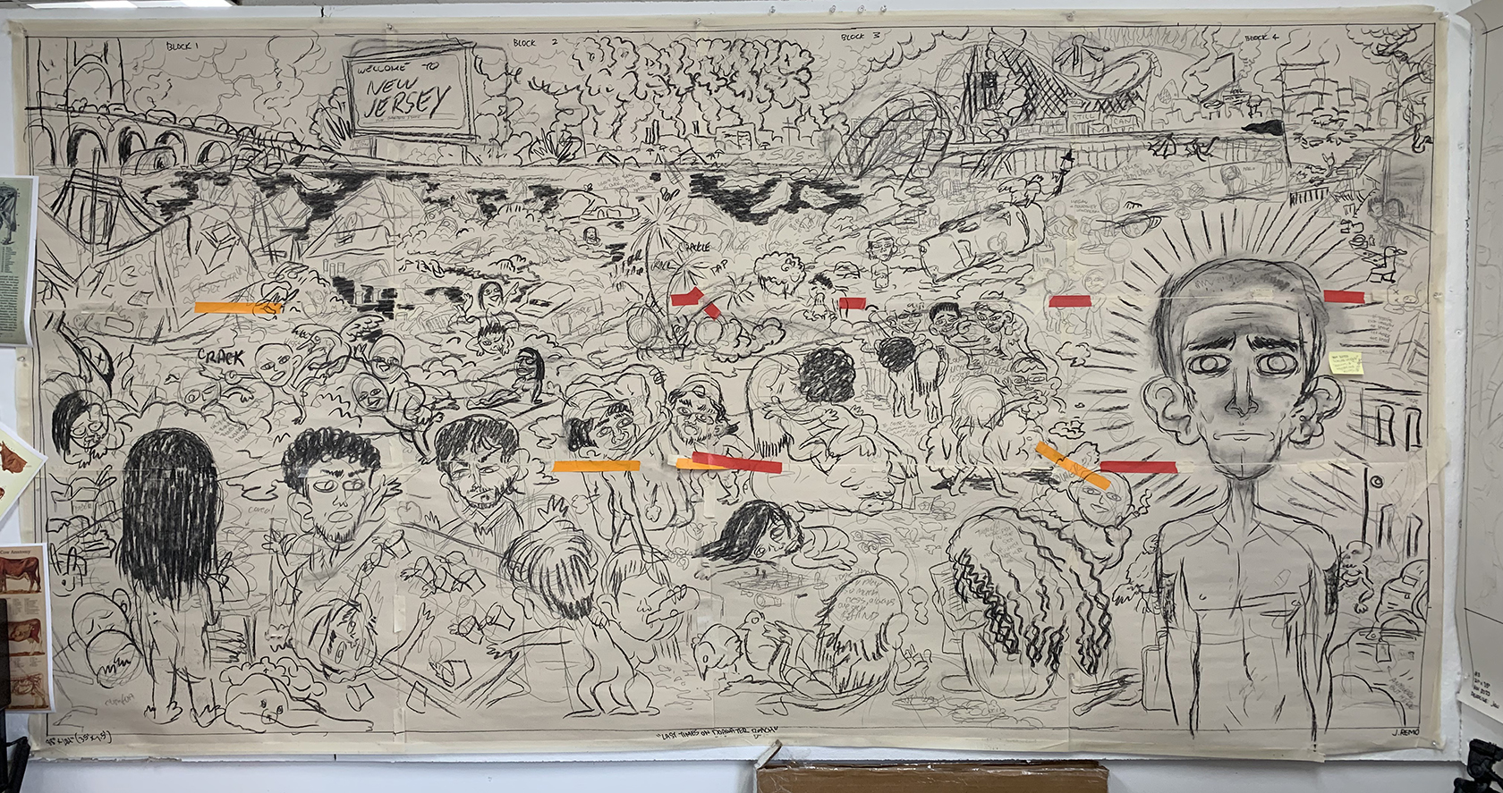
This section attempts to give a sense of the enormity of Remo’s mural project and how he made it happen. Naturally it all begins with an idea. So I asked: “The conception for three smaller woodcuts began in your journal, but how did the idea for the mural come about? Was there ever a preliminary sketch other than on the full-size taped together newsprint?” He replied:
“The first iteration was a small panoramic drawing that I illustrated in my sketchbook. I was thinking a lot about Georges Seurat’s “A Sunday Afternoon on the Island of La Grande Jatte” and imagining how I could create a similarly stunning overlook with my own locally apocalyptic distortion. During my research, I came across a magazine article that studied the many works inspired by Seurat’s magnum opus and how the artists developed their own serene environments through various mediums in a context relative to Seurat.”
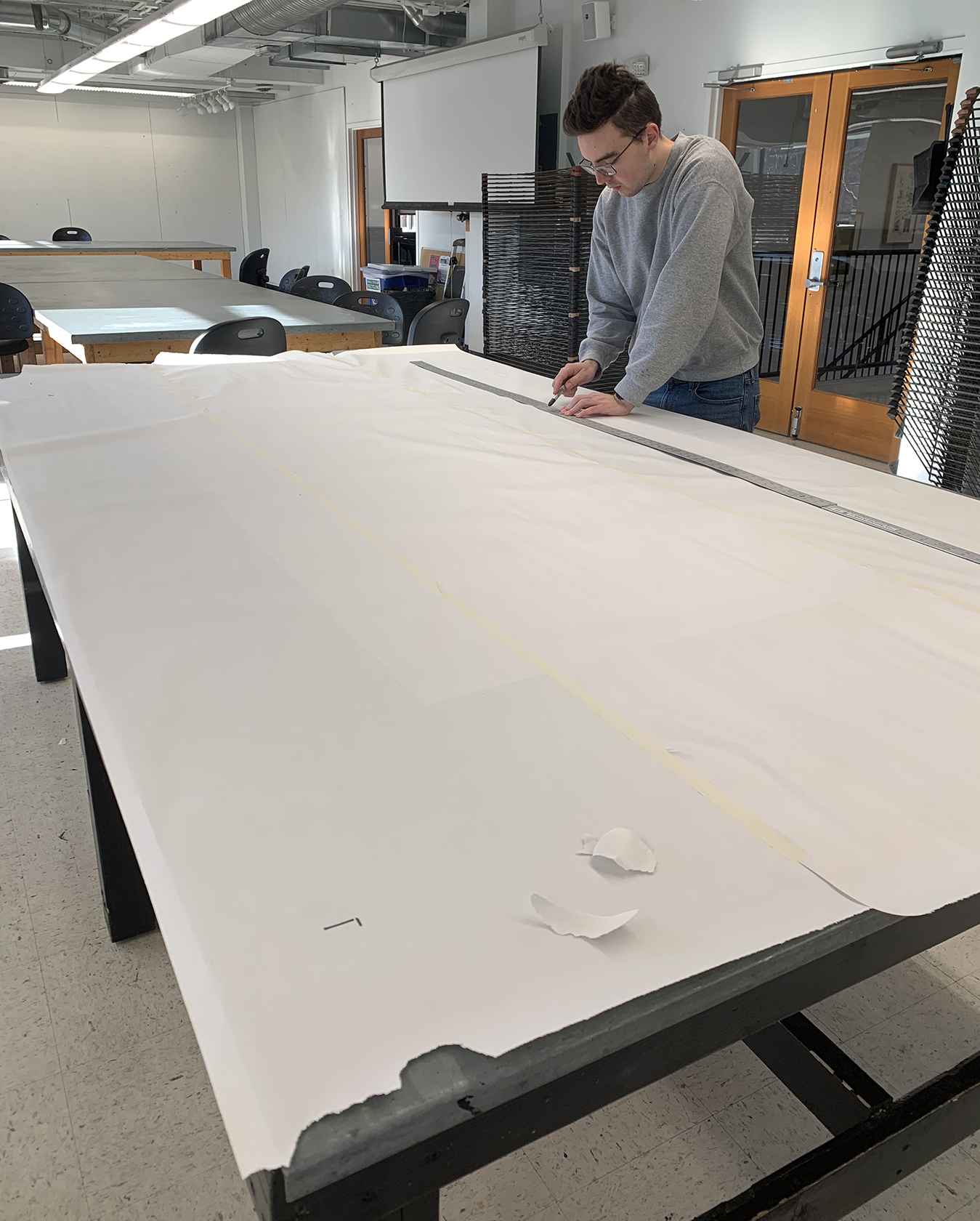
The only instance in which I was in any way of service to Remo was in helping to tape together sheets of newsprint for his triptych mural. (Ponemone photo)
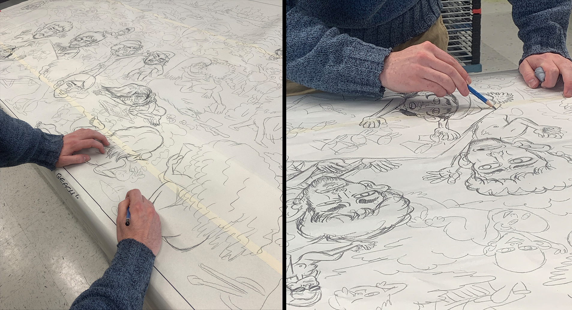
Remo made his initial version of the mural on the paper, shown above. For a finer rendering of his ideas, he said, “When I was ready to transfer the image, I used a projector to trace the sketch onto a new bundle of newsprint, rendering a more detailed final drawing to transfer onto the block. I spent the whole first week of the semester working out every little detail before running it through the press with the wood.”
In these photos Remo is enhancing his drawing that he had transferred via a projector.
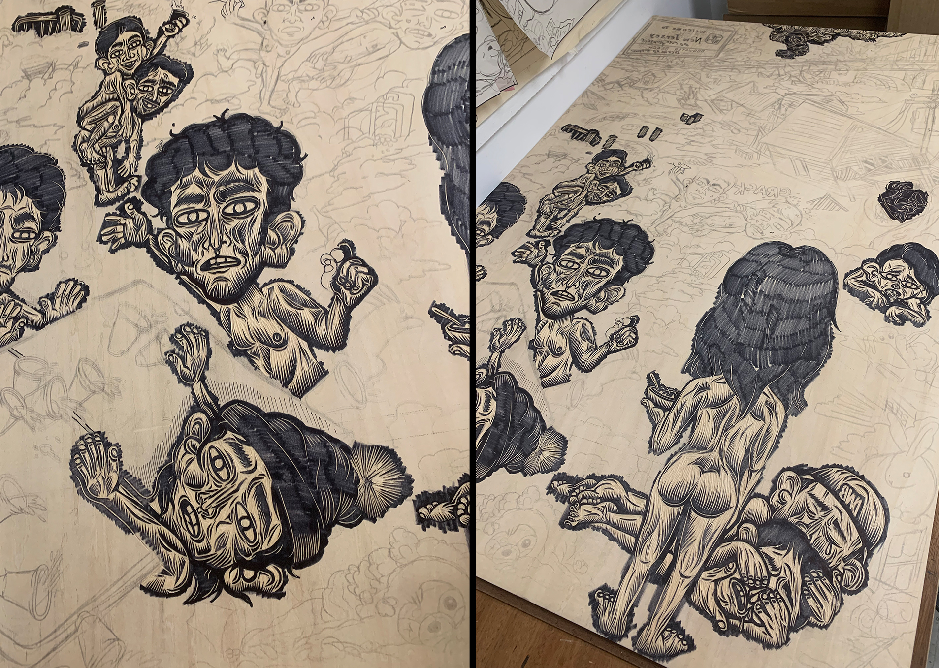
When Remo attacked a figure in the block, he would first cut into the raw wood. Then to better see the effect of his cuts he would blacken the areas with a thin Sharpie “to reinforce lines that may not have transferred visibly on the block.”
These closeups give a sense of Remo’s tool usage. As to his tool selection, he said: “I would switch tool sizes here and there to create different line weights and textures, but for almost the entire triptych, I used the smallest Flexcut V-gouge tool I had.”
And to maintain his tools, he remarked: “While carving I would use Flexcut Slip Strop to hone my tools every thirty minutes or so. This practice allowed me to carve effortlessly, and was extremely important for delicate details like the faces of different characters. Once a block was finished, I would send the tool to be professionally sharpened in order to guarantee that it was pristine by the time I started the next.”
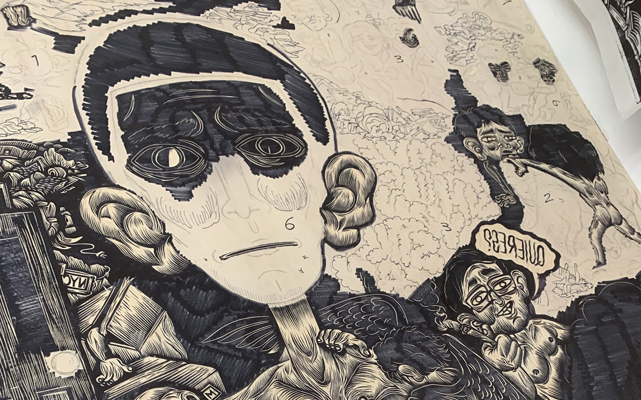
This closeup of the block that would become the right third of the mural shows that Justin numbered sections of it before he cut it. So I asked him why he did that. He said:
“The numbering system was just my own convoluted method of calculating deadlines on myself and reinforcing self-discipline. Since I only had one month to carve each third, I quantified certain sections and estimated how much of the surface I could carve in a certain amount of days. I typically started with people; they were the most important parts and I wanted my tool at its sharpest. Once they were carved, I would gradually develop the background.
And why I asked did he start by cutting the left third of the mural, then the center and finally the right third. His reasoning:
“I couldn’t decide. So I had my friend Bob Cicero choose for me. He was watching me transfer the images onto the blocks when he recommended left to right, assuming that it would result in a decrease in difficulty as the semester continued. In the end, I would say that it did not really matter. They all took an incredible amount of time to finish.”
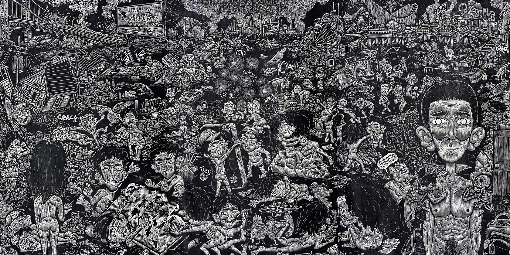
Justin Remo, “The Last Times On Dogwater Beach”, woodcut printed on three sheets of paper then joined, 50″ x 91″, Ed. 10. (Remo photo)
Big Finale
For Justin Remo the huge size of The Last Times On Dogwater Beach mural was essential. It served as the centerpiece of his thesis presentation, with the three smaller woodcuts to its left and three monotypes to the right of it. When I asked him why is the mural’s size important, he replied:
“I wanted each piece in this exhibition to steal the gaze of anyone who saw them on display, no matter where they saw it from. Hung at such a colossal size and printed in black, I wanted this triptych piece to pull viewers in and capture them within the frame, forcing them to look at every intricate detail carved out of their matrices. At times, when asked about my home, I have referred to it as a black hole; so magnetizing and inescapable. I felt it only appropriate that this piece had the same effect on viewers within a gallery space.”
The vast majority of the mural is covered with people run amok in an environment run to ground. What was his thinking behind when designing all of that?
“When I decided to split the piece into three blocks, I began sketching the background into thirds as well, each focusing on a referential piece of New Jersey landscape. The traffic-swamped highways, the smog spewing industrial plants, and the trashy boardwalks, which became a horror scene for many after the tragedy of Hurricane Sandy. This area of the composition dove into the ecological damage and deteriorating landscape of my home and to engage in so many conversations about this aspect of my work was amazing.”
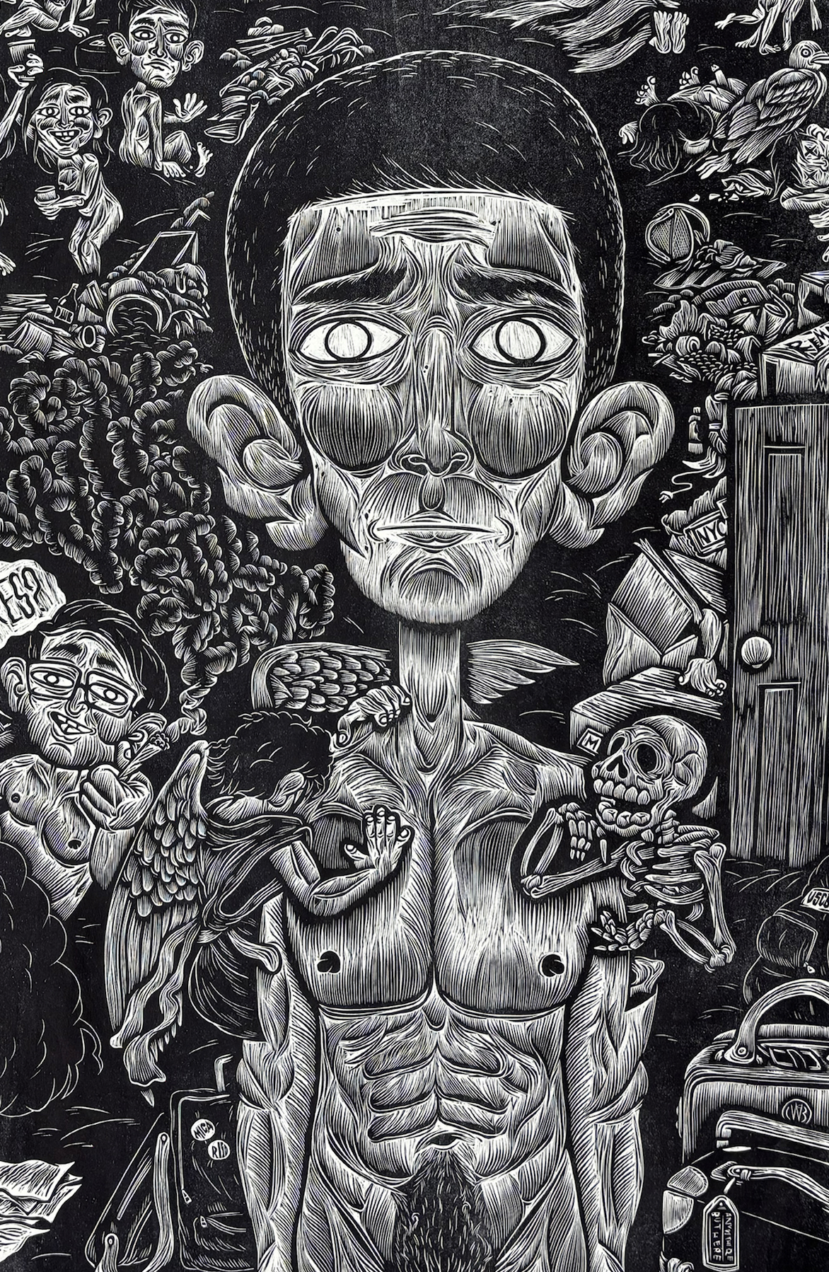
Remo’s whole project is very personal–even autobiographical–so it was not surprising that I suspected that the oversized figure in the triptych mural stood for the artist himself. Naturally I asked if that was so.
“The main character in this piece is somewhat of a self-portrait. Yes, the character brandishes my tattoos and my physical anatomy, but is emotionally and mentally an amalgamation of everything I have experienced up until now. An immense collection of experiences, lessons, and personal transformations live within this portrait. Carving these years of change into a tangible matrix allows me to more easily let them go, turn countless choices and perspectives into an artifact that I can reflect upon and move on from. I have always enjoyed making art that becomes a personal time capsule.”
And why, I asked, did he need to make this figure so much larger than the others?
“I wanted this character to be a direct connection between the fictional reality of my thesis and the reality of whoever was on the outside looking in, to break the fourth wall. The main portrait was carved to be life-sized and stare directly at the viewer, exhibiting a moment of hesitation, fear, and questioning. I imagine visitors of the exhibition will have different reactions or thoughts regarding the character and the world it is centered within, as have many of my professors and peers.”
With the principal character so mush larger than any others in the mural, I wondered how he approached cutting it. He replied:
“A lot of preparation went into the principal figure. I had to figure out how to carve this character in a way that kept the same style as the other caricatures, but still seemed closest to the viewer. I consulted a lot of other students during my three-day process finalizing the portrait, and I am very happy with the results. At first I referenced various muscle anatomy charts, using them to guide my carving, but I had a sort of EUREKA moment when I figured out that removing more of the wood allowed for it to share a similar appearance with the rest of the characters.”
And was he pleased with the results? “I was very satisfied with the results, and it was a prime example of the problem-solving aspect of printmaking, specifically woodcut, that I adore so much.”
And what was he aiming to communicate in the face of the main character? “I would say uncertainty would be the best descriptor. From the original sketch into the final cutting, I wanted the main portrait to express contemplation. People have told me they see fear, regret, concern or sadness, and all of those would be just as correct. It is a face that harbors many of those emotions at once.”
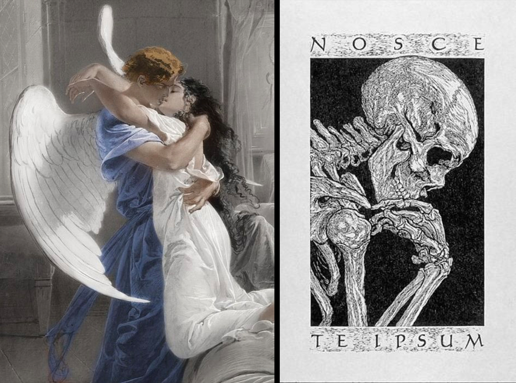
(L) Mihály von Zichy (Hungarian, 1827–1906, “Romantic Encounter,” 1864, pencil, brush and ink, with white on paper, 21.9″ x 16.7″; (R) Tru Ludwig, “Nosce Te Ipsum, woodcut
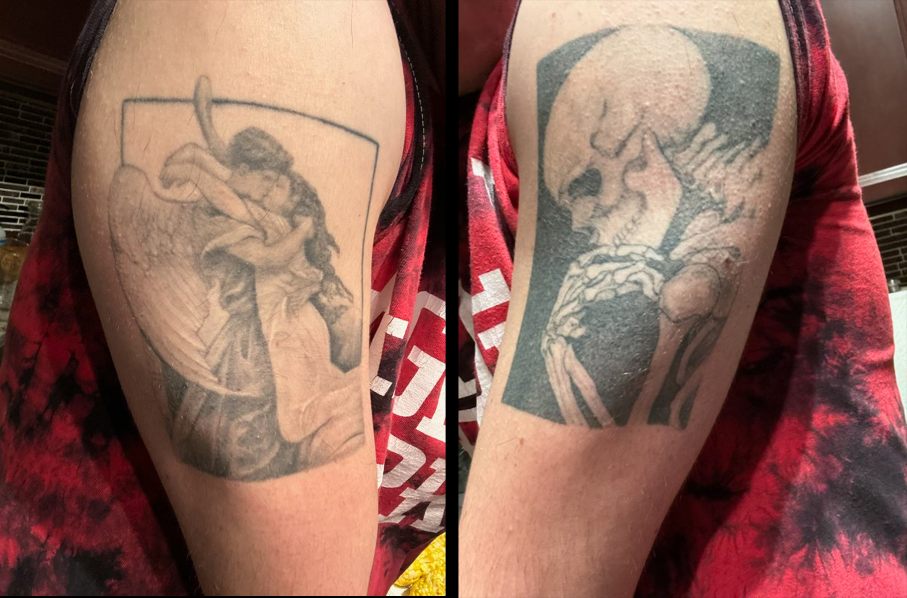
On one shoulder of the big figure is a gesturing skeleton, while an angel hides its head on the other. They represent Remo’s actual tattoos. What’s the story behind them, I asked.
“I got my first tattoo (Romantic Encounter, a painting by Mihály von Zichy) in high school, and to be frank, I got it because I thought it looked cool and my parents said they would pay for it. It wasn’t until I got my second tattoo (Nosce Te Ipsum, a woodcut by my printmaking professor and awesome friend, Tru Ludwig) during the pandemic that I began developing personal meaning behind them both. They represent periods of great change within my adolescence; the first during a time of interpersonal dependency, the other during a phase of isolation and intrapersonal understanding. They reflect on my past in a way that I only realized years after I got them, and it wasn’t until the final sketch of this project that I decided to include them in the composition.”
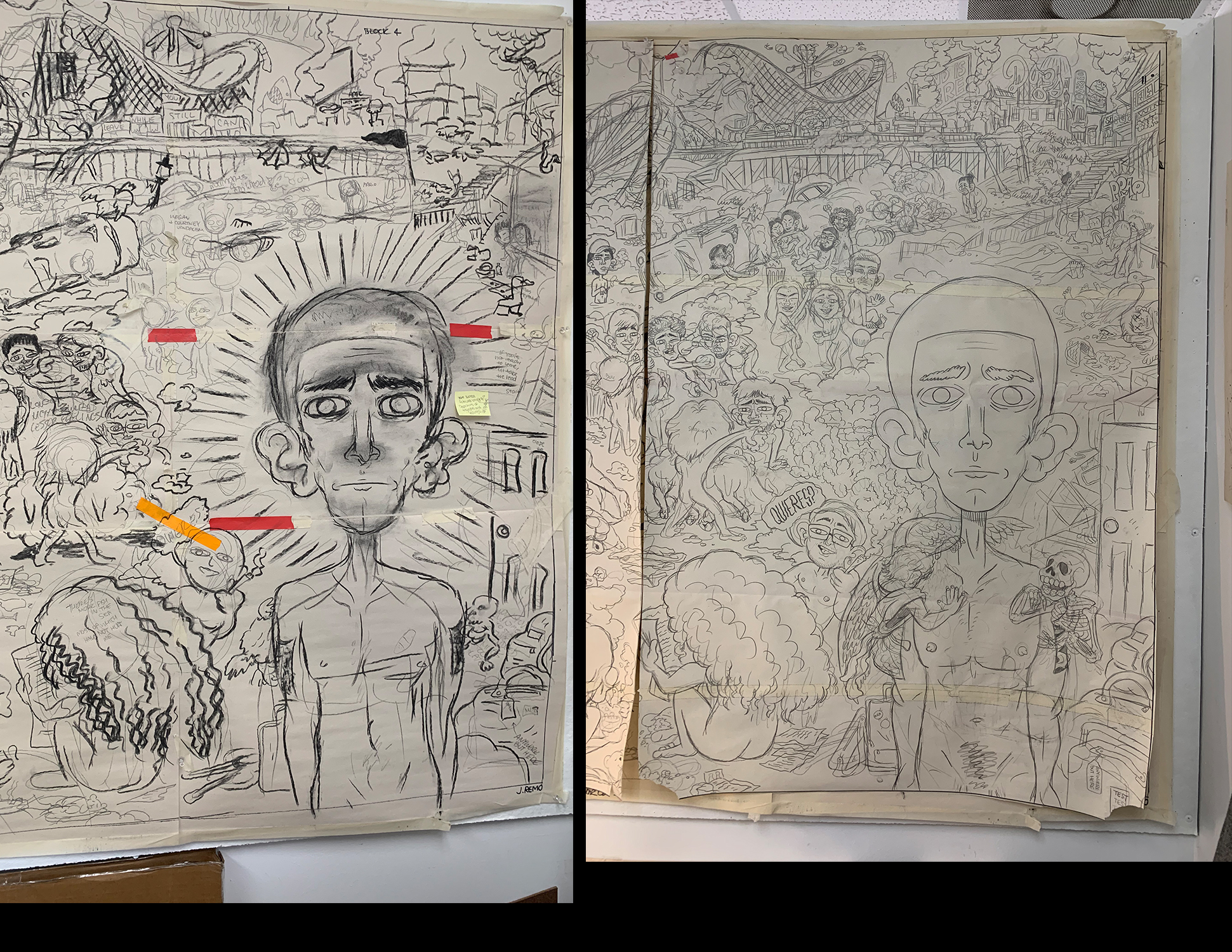
When Remo refined his initial mural drawing (L), the figures attached to the main figure’s shoulders became larger and more expressive. (Ponemone photo)
I sent Remo these two photos and said: “It looks like you really gave it some thought in enlarging and defining the angel and skeleton. Why is the angel emerging from your arm and clinging to you, head pressed against your shoulder? And why is the skeleton (devil?) in a more aggressive mode? It looks like it’s coming out of a hatch in your arm, right?” His responded:
“I wanted different aspects of this piece to cartoonishly warp reality and reflect my own headspace. There are little illustrated details that give context to personal perspectives. The tattoos are a perfect example. In this print, they appear as somewhat of an id and ego. One is driven by emotional impulses, the other driven by personal sustainability, relative to the morals I believed in when I first got them. I wanted to reference these permanent pieces of myself in this way to show how these periods of my life have affected me. It is a constant battle between the two, and an accurate portrayal of the emotional turmoil I experienced when making difficult decisions or looking towards my future.”
Then I said: “Your staring out at the viewer makes it seem that these two characters are going about their business without your control. Is that correct?” He replied:
“It’s reminiscent of that classic film trope I love so much: a character has an incredibly arduous decision to make and subconsciously conjures a devil and angel to debate morality from opposite ends of their shoulders.”
My last question about the principal character was: How significant was it that the big guy has turned his back on all the mayhem behind him? Remo wrote:
“The body language of this portrait is very significant. Amidst the calamity befalling this fictional shoreline, the main character chooses to turn away from it rather than engage. The complicated emotions embodied in this composition and the decisions implied inspire personal guilt. At times I have felt like I have turned my back on many people in my life. In this context, it would be physically true.”
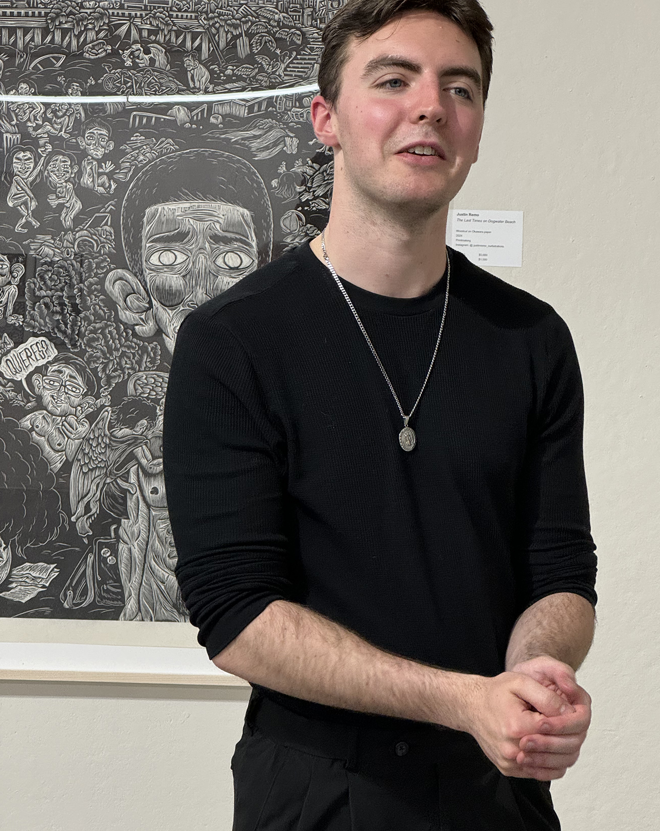
After hearing responses from folks viewing The Last Times On Dogwater Beach during Artwalk, when MICA seniors get a formal exhibition of their theses, Remo had these thoughts: “There are so many stories happening within these three blocks that are personal to me and what I experienced growing up back home. However, were I to pinpoint one aspect to focus on, it would not be characters, it would be the background. One of the most common comments I received during MICA’s Artwalk was how much viewers enjoyed falling into the horizon of the mural. They found it to be intriguing and simultaneously relatable, which was a reaction I was very happy with.”
Remarkable Feat
The Last Times On Dogwater Beach is an outstanding achievement for any artist, not just a college student. While above I focused on the main character, what’s really a delight for the eyes and a catalyst for sober thought is all the reprobate behavior and environmental degradation going on everywhere else. It’s so ease to get immersed in Remo’s New Jersey. It’s immense and it’s well worth getting lost in it.
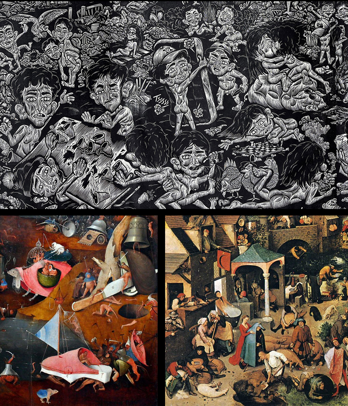
It’s no exaggeration to say what The Last Times On Dogwater Beach brings to mind are the works of two artists I’ve long admired: Hieronymus Bosch (Dutch, 1450-1516) and Pieter Bruegel the Elder (Dutch, 1525-1569). Check out (above) the lower central portion of Remo’s mural with (L) the lower central panel of Bosch’s triptych The Last Judgment, c. 1452, in the Academy of Fine Arts, Vienna, and (R) Bruegel’s lower central part of his Netherlandish Proverbs, 1559, in the Gemäldegaleries, Berlin.
But I do have a quibble about the cutting of the principal character.
Justin Remo has used his years as the creator of “Dust” comics (see previous Remo blog post) to become a gifted cartoonist and an able renderer of the human figure, particularly in motion. He quickly adapted that talent into designing his woodcut images. He pointed to me that in Swallow Your Pride, the first of the block he cut, the first figure he cut was the guy under the cow sucking on an utter. His cutting was a bit tentative there. He recognized that and immediately made great strides in cutting the rest of that block and all the blocks thereafter. There’s a sureness in his cuts and a consistency in his mark making.
However–and this is just my opinion–he made a mistake in cutting the big figure on his mural. Instead of relying on himself, he turned to an anatomy book and consequently gave the figure an anatomy-book torso with six-pack abs and well developed pecs. The muscles on the arms and even the face are also too well delineated. What would have made that important figure come forward and separate it from the frantic activity everywhere else would have been to make the big figure whiter, i.e. open the figure up be removing more of the wood. Even the cutting could have been broader, with bolder lines and fewer of them. As quoted above he recognized that issue and said by “removing more of the wood allowed for it to share a similar appearance with the rest of the characters.” I sense that he should have removed more wood to distance it from the other characters.
Synthesis
When I first saw his initial drawing for the mural, I told him the big figure on the right seemed out of place and that the whole scene appeared static to me. I even proposed that he should consider making the foreground a close-up view of a roller coaster with tracks the swoop from one side of the mural to the other. He could have drawn several cars occupied with revelers and yet have the main character alone in other car to show his separation from the crowd. But now seeing the completed mural I better understand the importance of that lone large figure not engaging in the mayhem everywhere else. The artist, I believe, not only needed to position a surrogate of himself turning his back on an environmentally damaged New Jersey and its distructive inhabitants, but also needed to make amends for his own participation in similar misdeeds.
In his three woodcuts that Remo completed in the fall semester of his senior year, he focused on specific activities of his new Jersey friends that he found unfortunate at best and distructive at worse. As quoted above: “Swallow Your Pride brings portraits of gluttonous consumerism alongside mindless and ceaseless consumption. No Strings Attached displays an awkwardly erotic scene of sexual repression and obsession amidst warfare beyond. And Throwing Caution To The Wind reflects the reckless and irresponsible activities endemic to New Jersey youth, almost always related to cars, drugs, or alcohol. Each of these individual prints focuses on specified exaggerated environments that expand the humorous and appalling world in this series.”
And as to the fourth intended image from the fall semester–”Don’t hold your Breath”–Remo wrote in my first blog of his work: “This one is a scene of mindless violence, wrath pinning human against humans. I have encountered many people, including friends, who have no regards for others, only focusing on themselves, sooner leaving companions behind before letting themselves fail. The careless destruction of lives around them.”
I suspect that as a member of his New Jersey friends group, he had engaged in activities that he would not have done had it not been for peer pressure. Had he engaged in “gluttonous consumerism”? Had he experienced sexual activities he regrets? Had he drank too much or used drugs too much or been involved in dangerous play (with cars)? Had he even been involved in violence toward another person? So was his senior thesis more than just disavowing all those activities he was involved in as part of a gang of friends? Was his thesis also a making of amends to himself for engaging in any of those activities?
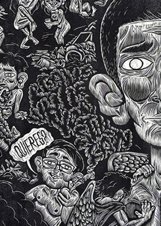
With prompting, I realized that in his mural Remo added a message to himself that he cut just to the left of the main character. It reads “Leave while you still can.” It materializes from the smoke from the joint held by the little figure asking the question: “Quieres?” (“Do you want it?”) Sometimes the best and maybe the only way to make amends is to simply remove yourself from the situations in which regrettable activities had occurred. I suspect that the creation The Last Times On Dogwater Beach was Justin Remo’s way of making amends.
★ ★ ★
Trackback URL: https://www.scottponemone.com/justin-remos-big-finale/trackback/

