New Home for MICA Printmaking

The entrance to 15/15, the new home for MICA’s Printmaking Department. (This and all photos by Scott Ponemone)
Precede
Consider this blog post a primer for the Saturday, March 24, PDPS visit to the new home for MICA’s Printmaking Department. The interviews and photographs for this post were initially made in February and March for an article in On Print, the journal for the Washington Print Club.
The Decision
In the middle 2010s the Printmaking Department at Maryland Institute College of Art was at a crossroads. Its home in the Dolphin Building needed a serious overhaul. At the same time the school was looking to create a home for its design programs (Architectural Design, Interactive Arts, Game Design and the new Product Design). Jonathan Thomas, the department chair, said:
Although the [Dolphin] building had some excellent qualities, it had some massive deficiencies–primarily associated with safety and professionalism–that simply needed to be changed either through complete renovation or a wholesale move….
We were initially in favor of renovation, but when the idea was proposed to move to 1515 [Mt. Royal Avenue], we recognized the benefits and began working to make this a possibility. It was a larger space with a bigger footprint, expansive classrooms, and a more central location on campus, but the process absolutely took negotiation. Moving a printmaking department of this scale is never easy, particularly over multiple phases, so there was some obvious concern about the massive amount of work necessary to make it happen, the coordination of the various partners, the sophistication of the integrated HVAC/ventilation system, but most importantly concern for interrupting our momentum as a department within the school. Once we established the move was happening, we immediately looked at the process as an opportunity for expansion and innovation, not simply a change of scenery.
So the decision was made to raze the Dolphin Building and create the Dolphin Design Center in its place. Despite its problems, the loss of the old Dolphin Building is felt by some who used to work there. Quentin Moseley, who began teaching at MICA in 1974, said, “I miss it. I was used to it, and I not only taught prints but made prints there over the years. So I just enjoyed that building when I came in to do my own work as well as teaching there.”
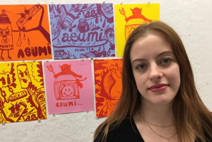
Senior printmaking major Sophia Gallo
Sophia Gallo, a senior printmaking major from Brooklyn, New York, told me, “The Dolphin building was nice because it had a very nostalgic, welcoming, and homey feel to it. I definitely spent a lot of time working in that building, becoming acquainted with the space. So it was sad to say goodbye.”
15/15
The installation of the Printmaking Department at 15/15 (as the existing two-story 1970s building at 1515 Mt .Royal was renamed) took two years.
“The time it took to demolish and rebuild Dolphin and the displacement of classroom/departments in 15/15,” Thomas remembers, “necessitated the move to occur over two phases. We developed a plan that we felt would have the least negative impact on the department.” For the 2016-2017 academic year, the department set up the screen-print space, the primary press room, the Globe Press (more on globe later), and letterpress. The rest of 15/15 was finished in time for the 2017-2018 academic year. This included a completed lithography studio, the archives for Globe Press, studios for seniors, and an editions studio set aside for seniors and visiting artists.
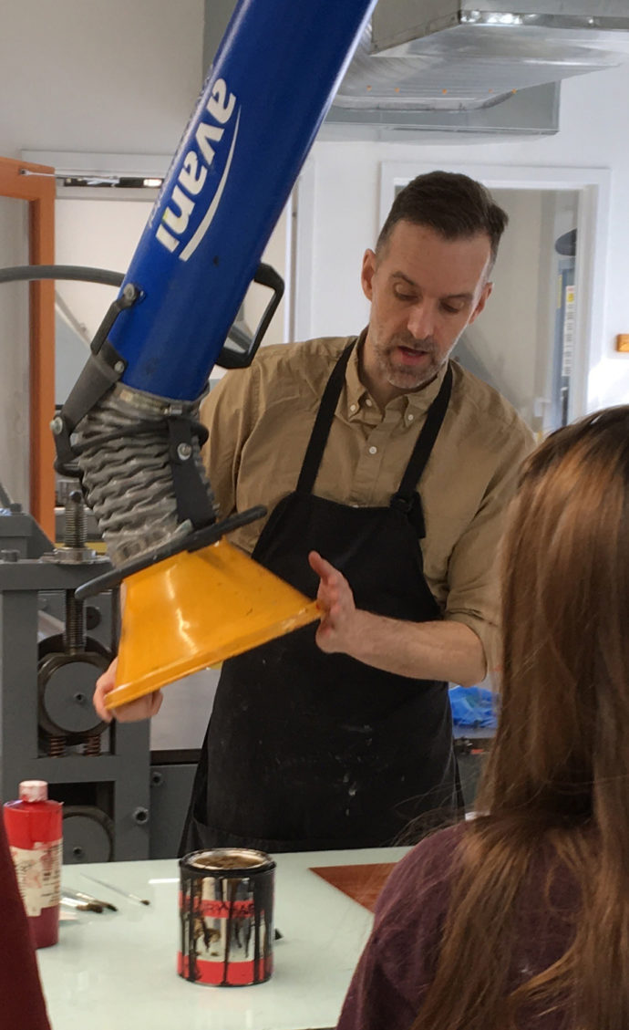
Jonathan Thomas demonstrates how to place an arm of the exhaust system when using solvents in the intaglio studio.
One major problem with the old Dolphin Building was the lack of an elevator and its general inaccessibility to people with disabilities. Its lack of effective ventilation and air conditioning was another significant issue. On hot days, the lack of AC meant windows needed to be open. This invariable resulted in dust settling on the wet ink. So in planning 15/15, Thomas also acknowledged:
“The single biggest issue was ventilation throughout the department that was integrated with an HVAC system so that the air in the building is constantly getting replaced. So that’s something that we wanted to have in the entire building in all of the studios. It’s a very complicated system that we are still fine tuning.
Studio by Studio
All five full-time printmaking faculty members (Thomas, Moseley, Gail Deery, Eva Wylie, and Robert Tillman) plus long-time part-time member Mary Mashburn and Globe Director Allison Fisher helped design the new studios, but much of the design and fabrication of studio equipment fell to Kyle Van Horn, the department’s Studio Manager. He was an undergraduate from 1999 to 2003, and a year later he became the department’s tech person.
According to Van Horn, the move to 15/15 gave him and the faculty “the opportunity to rebuild the department. Not from scratch, but the way we really, really wanted it in a new space. And so a lot of the layout for the studios and the built-in fixtures, I had a major hand or the only hand in creating.” He continued:
So for example in the screen-printing studio, all the tables are my design, so there’s storage and work surface. And in etching a lot of the big ink slab work surfaces are sort of my design, integrating storage and glass ink palette surfaces. In lithography, we couldn’t find any of the fixtures we wanted in terms of sinks. And so we had a custom litho graining sink built and fabricated a photo sink for developing lithography plates…. In the paper-making studio, we needed a drying system. We had an existing drying system that was functional but not terribly powerful or good or durable…. I was pretty convinced that I could design something better still, and so I prototyped one over the beginning of the summer [of 2017] with a strong industrial fan, which pulled air through the boards…. The system that we ended with is very sturdy, keeps the paper very flat, tends to dry it very quickly because the fan we use moves a lot of air, and so it’s able to dry paper in about half the time of any other system we’ve used.
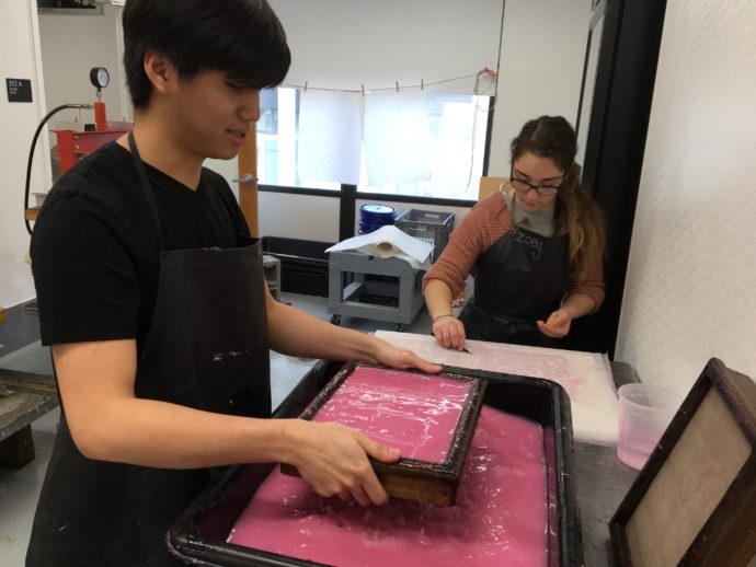
Shawn Chia and Zoey Russomano, both majoring in book making, work in the paper-making studio.
Gail Deery, who teaches paper-making, praised the way Van Horn worked with her to create the new paper studio: “Kyle did much of the designing of all of the spaces. He worked individually [with faculty]. He would ask, ‘What do you need in the paper studio?’ So together we sat down and worked on the layout for the floor plan and what would happen in the space, versus what could happen in the space.”
Jonathan Thomas described the improvements found in 15/15 studio by studio:
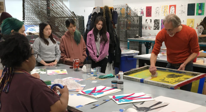
Students watch as longtime MICA Professor Quentin Moseley applies a mask in his screen-printing class.
Screen printing: “The biggest issue in screen printing is just room. We added more table space so there can be more students working. We added additional space and equipment in the washout room and the exposure room. We previously only had one washout booth, now we have two separate washout booths. We have a new washout booth in the exposure room as well, but the biggest issue there is just more room so that things can be done at a greater scale and more safely…. There are also three new presses in the printing area.”
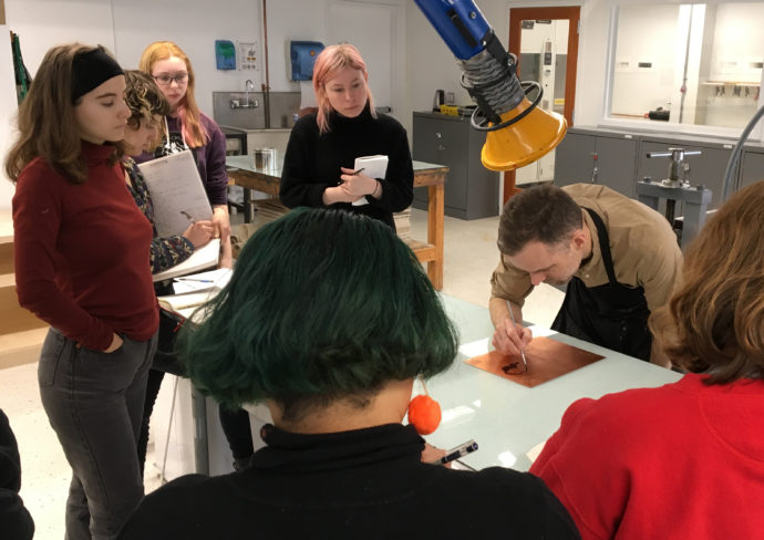
Jonathan Thomas paints a mask on a copper plate for his intaglio class.
Intaglio: “Once again, the biggest issue with this room is space and a couple of key safety aspects to the ventilation.” What was “really key for us” was having separate rooms for applying grounds to plates and for etching plates with acid. “We did have a separate acid room in the previous [Dolphin] basement. It was very small. All the grounds work that we do–the grounds or the petroleum-based substances that are used for Intaglio for resisting in the acid–we wanted to put them a safer space. So all of the grounds and the acids are in separate rooms, not open into the main classroom area. This is really important for air quality and making sure that there are not fumes in the space that you don’t want in the space.”
Relief: Classes in relief printing, including woodcut, wood engraving and linoleum cuts, also uses the intaglio studio because both intaglio and relief uses the same presses. Thomas noted that they were able to purchase and recondition a “small relief proofing press.”
Lithography: “There’s a new large electric litho press, which is fantastic… We also have new graining sink, new shelves for all the litho stones. Everything’s been redone and redesigned by Kyle, and it’s all fully integrated at this point.”
Edition studio: “One completely new space that we have here is the edition studio, which is a separate studio altogether that has the capability of doing most print media. So there’s a new intaglio press in here, and there’s also a new screen printing press. This studio has the capability of doing screen work, intaglio work, relief work, litho work, and it’s kind of like a boutique separate studio that’s used by the seniors exclusively as well as for special projects. So when a visiting artist comes in, they can do a special project in that room, separate from the classroom spaces.
Paper-making: When I mentioned to Thomas that Kyle is really proud of his drying boxes, Thomas said, “Yeah, he should be, pretty awesome. He built and designed these great new drying boxes, which we’re actually going to get more of and put into the intaglio/relief studio because there’s nothing like them, and they work so well.”
Computer lab: The computer lab is “doubling as our printer room/technology space. In this space right now we have our inkjet printers, scanners, 16 computers, and then a Risograph machine. Next year, we’re also going to put into this space a plotter/cutter, which will do a variety of cutting on various materials that will be useful for a range of classes. So it’s half-way a computer classroom and both a space where digital printing and tech oriented material operations take place.”
Regarding the computer lab, Thomas noted that the former Dolphin Building had separate computer and printer rooms, and that 15/15’s combined lab is a “a bigger space, a more professional space, a cleaner space…. A space that is definitely evolving. I can see this space turning into something that’s more oriented towards all of our technology that we’re bringing into the department over time. Having it be less of a computer lab and more of like a working tech lab I think is a possibility for that space, but we’re not entirely sure.” In short, he sees the lab as the fulcrum that integrates the traditional print media of intaglio, litho, screen printing and relief with MICA’s push for being a 21st-century institution as exemplified by the new Dolphin Design Center.
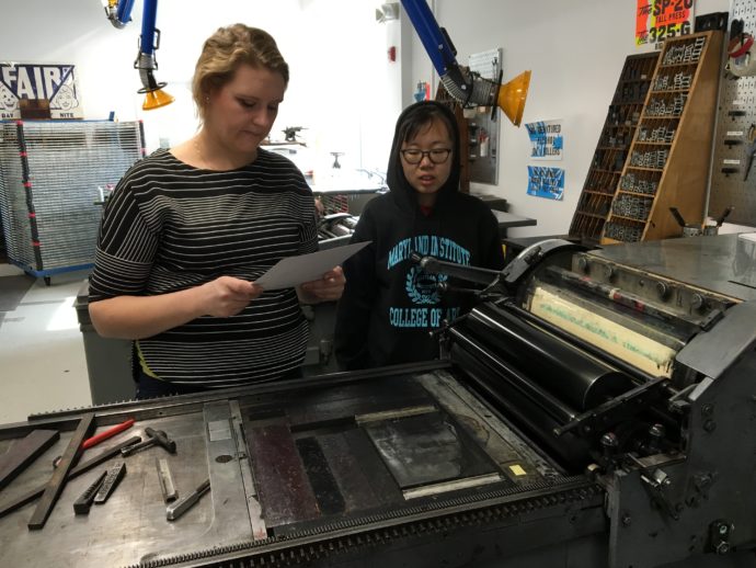
Allison Fisher, who oversees the letterpress studio, and Jaydu Xu, a junior illustration major, examine of proof in the letterpress studio.
Letterpress & Globe Press
Given a prominent location at 15/15 is a studio for the Globe Collection and Press. Purchased by MICA in 2011, Globe Press was renowned for printing posters for rhythm and blues concerts in New York, down the East Coast, and across the Gulf Coast to Texas. In a 2012 article in the Newsletter, the journal for the Print, Drawing & Photograph Society of the Baltimore Museum of Art, Bob Cicero, the last private owner of the press, said that since its founding in 1929, Globe made posters for “carnivals, fairs, and cheapest events. These were the entertainments for poor people.” (Newsletter, Vol. 30, No. 1, page 15)
“These posters grabbed your attention,” Cicero said. “And when Rhythm and Blues came along, we made the letters more bouncy to echo the movement of the R & B music, and we used those bright Day Glo inks so the posters could be seen at 20 feet. We plastered them up at the busiest corners in Baltimore.” To make such bold posters, Globe created multiple fonts of hand-carved wood type. Cicero still teaches letterpress at MICA.
Because Globe Press is an archive, Thomas related, “there were security issues we had to then deal with because the Globe material really had to be locked down, and we had to be careful about who was going in and out of that room…. So we’re not fully resolved in that regard yet, because the Globe press [the press in the Globe space] isn’t functioning, but the concept is Globe can independently be running projects while classwork being done in the letterpress space.”
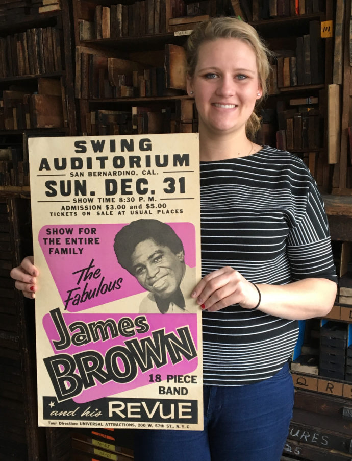
Allison Fisher, Manager of Globe Collection and Press at MICA, holds a vintage Globe poster advertising a James Brown concert.
Managing Globe Collection and Press and overseeing the adjacent letterpress studio is Allison Fisher (The two studios separate entities but are side by side because they used much of the same technology.) A 2011 design graduate of MICA, Fisher said:
“I helped MICA acquire the Globe Collection. I worked with Mary [Mashburn] and what we lovingly called the Friends of Globe. I helped them rally student support to bring Globe to MICA and then spent my senior year not really doing classwork, but helping get Globe ready to move to MICA. I spent my spring break at the nastiest warehouse I’ve ever been in. I was doing it because I thought it was the right thing to do. I was doing it for free. I was a volunteer. When Globe got to MICA, there was no real plan for what was going to happen. The acquisition happened very quickly by academic timelines, so it got to MICA without a real ‘what’s the next step?’ so it kind of crash landed in the letterpress studio that already existed in the Dolphin Building. Only a small handful of [Globe] stuff that was the stuff we deemed most readily usable–so a lot of type and some hand-carved printing blocks–was the stuff that came into Dolphin initially.”
The move to 15/15 allowed Globe to be adjacent to the letterpress studio. Fisher said:
The stuff in this front space here is all stuff from the Globe Collection. The stuff in the back [letterpress] space, there is Globe type in there. (There are a lot of duplicates.) That’s stuff that the students use more freely in classes, but that back letterpress space also has lead type and we have a photo polymer plate-maker in there. That space is a little bit more of everything. All kinds of materials used in letterpress, whereas this front space is dedicated just to Globe.
Even in its dedicated space, only a small portion of Globe materials are at 15/15. Fisher said Globe takes up an entire bay at MICA’s offsite warehouse. After the Globe purchase, she said, “We moved 16 box trucks and not the small, little U- Hauls.”
The amount of type that we have [at 15/15] is representative of just the scale of work that they were doing. We don’t have one drawer of a type size; we have seven. And there’s more type than belongs in those drawers. There’s an overflow of that stuff. We just have insane quantities of materials and hand-carved blocks, which I think is the stuff that’s most interesting to the students because a lot of them—especially the printmakers—do a lot of hand-carved traditional work. That’s the stuff that they get excited about because it’s relevant to the things that they’re working on.
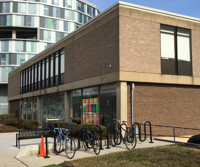
Colorful posters made with Globe Press fonts make for an inviting approach to 15/15.
Asked why Globe got such a prominent position in 15/15, Fisher said:
Globe’s cool. Globe is a really unique collection, and it’s also very visual collection. The design pieces, all these hand-carved blocks are really unique. They’re really unique to MICA. MICA’s not a collecting institution, but Globe is an exception because it’s a working collection. We want people walking by to be able to see that this is the thing that has a new life at MICA, that we’re still using to make new work with.
TESTIMONIALS
So how successful has been the Printmaking Department’s move to 15/15? Here are responses by four printmaking majors.
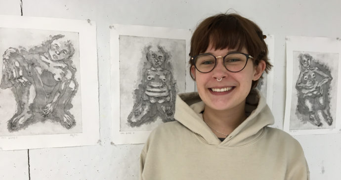
Madeleine Salapow with four of her figurative etchings
Senior printmaking major Madeleine Salapow, from Pittsburgh, said: “It’s completely amazing. We were all kind of nervous at first because there was a big connection with the old building. It was really old. It’s always been the printmaking building, like it’s very homey. But here, immediately, everyone loved it. We were all worried, but it turned out really nice. I mean, we have so much room now. It’s really bright. The ventilation is much better.”
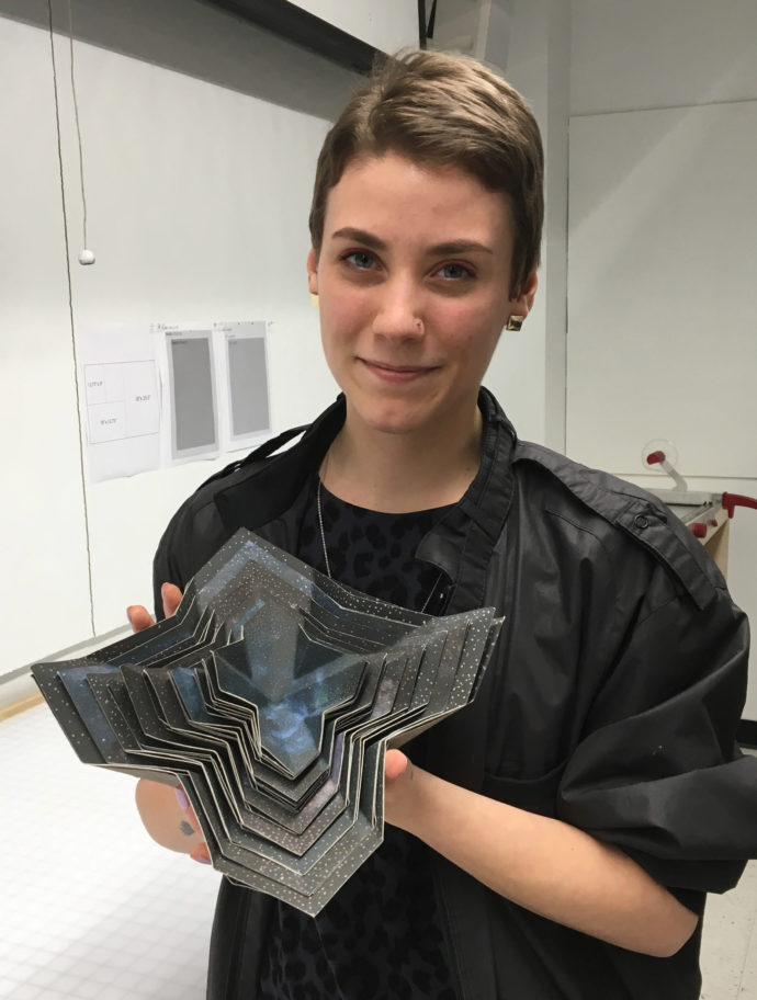
Madison Scillian used inkjet and screen printing to create “Nest.”
Madison Scillian, a senior printmaking major from Detroit, said: “I don’t think that I could have ever asked for a better space to be learning printmaking, and our new facilities here in the 15/15 building are world class. They’re absolutely stunning.”
Sophia Gallo, a senior printmaking major from Brooklyn, New York, said: “When we came into this building, it was just so impressive. They were just able to give us so much more space and resources that I quickly got over it. I missed the old building, but there were definitely structural issues and things that were getting in the way of perfect printing, like things like dust.”
As to the faculty’s perspective on the success of the move, Thomas said:
The response from our students has been completely positive. The new spaces are truly fantastic, and I’m proud of the work our department and school did to design such great spaces. They are safe and comfortable. Classroom workflows are thoughtful, and the workflow between classrooms is greatly improved, supporting cross media work and collaborative exchange. This is our first year fully operational in the new space, so it’s a little bit early to tell how the move will affect interest or our major numbers, but our classes
are full and as long as we continue to offer dynamic classes and programming printmaking will continue to be a successful component to MICA’s goal of producing the next great generation of creative thinkers.
Trackback URL: https://www.scottponemone.com/new-home-for-mica-printmaking/trackback/


